A prospect recently approached The UI Studio with their struggling VSL landing page. Despite targeting premium audiences, their page looked generic and converted poorly. Their request seemed simple: “Add elegant backgrounds with black and gold theme for a luxury vibe.”
What we discovered during our analysis changed everything about their conversion strategy.
The Prospect’s Original Vision vs. Reality
Our prospect specifically requested:
- Elegant black + gold backgrounds for a high-end, luxury aesthetic
- Custom gold/white line-style icons matching premium branding
- Improved spacing, typography, and layout for exclusive positioning
- Consistent luxury brand identity that screams “high-ticket”
They believed visual polish would solve their conversion problems. They were only half right.
The Critical Discoveries During Our VSL Audit
When The UI Studio team analyzed their existing VSL landing page, we uncovered conversion-killing issues that went far beyond color schemes:
Brand Inconsistency Destroying Premium Positioning Their “premium” page featured jarring red highlights throughout the content while claiming to target luxury audiences. The left side of their VSL prominently displayed red warning text stating “HERE’S THE FINANCIAL DESTRUCTION YOU’RE ABOUT TO ENDURE” with a bright red “$4,700” figure – completely contradicting their desired black and gold luxury aesthetic. Red screams urgency and discounts – the opposite of exclusive, high-ticket positioning. This color psychology mismatch was sabotaging their premium brand perception before visitors even watched the video.
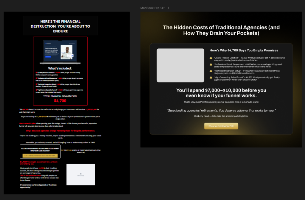
Before: Red color scheme destroying premium positioning and cramped layout creating visual chaos
Layout Chaos Killing User Focus The original design cramped five distinct audience segments (Entrepreneurs, Side Hustling, Digital Creators, Coaches, and “If you feel stuck”) into a single horizontal row, creating visual overwhelm that confused rather than convinced. Each segment was fighting for attention with dense text blocks that made the page feel cluttered and unprofessional. Premium audiences expect clean, digestible information architecture that guides attention strategically, not chaotic layouts that require mental effort to process.
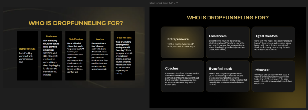
Before vs After: Transforming chaotic five-column layout into elegant, scannable audience segments
Content-Design Misalignment Beautiful gold and black themes mean nothing when your content structure fights against conversion psychology. Their page looked expensive but failed to build the psychological journey that high-ticket buyers require.
Our Strategic VSL Landing Page Analysis & Recommendations
The Color Psychology Overhaul We Recommended We identified how to eliminate the conversion-killing red “financial destruction” messaging and transform it into a sophisticated premium presentation. Instead of fear-based red warnings about “$4,700” costs, we recommended repositioning this as exclusive investment insight using elegant gold accents against clean black backgrounds. Our proposed approach would maintain the same powerful message while reinforcing luxury positioning rather than discount urgency.
Information Architecture Redesign Strategy That chaotic five-audience section needed a complete overhaul. We proposed transforming the cramped horizontal layout into an elegant grid system where each audience segment (Entrepreneurs, Freelancers, Digital Creators, Coaches, Influencers) receives proper visual space and hierarchy. Our recommended design allows prospects to easily identify their segment while maintaining the premium aesthetic throughout. Each section would breathe with adequate white space and sophisticated typography that reflects high-ticket positioning.
Visual Hierarchy Recommendations for High-Ticket Psychology The right side of their page, which featured the main value proposition “The Hidden Costs of Traditional Agencies,” required enhanced treatment with better contrast ratios and refined typography. We recommended maintaining the compelling “$7,000-$10,000” investment messaging but presenting it within a premium design framework that supports rather than undermines the high-ticket positioning.
Why Most VSL Landing Page “Improvements” Fail
Surface-Level Design Changes Miss the Point Most agencies would have simply added gold backgrounds and called it done. But premium VSL landing pages require deeper strategic thinking. Color changes without conversion psychology consideration often make pages look expensive while converting poorly.
The Content-Design Integration Gap Your VSL landing page design must seamlessly support your content strategy, not compete with it. When visual elements fight for attention against your video content or call-to-action messages, conversions suffer regardless of how “premium” the design appears.
High-Ticket Audience Expectations Luxury buyers have different psychological triggers than bargain hunters. They expect exclusivity, authority positioning, and effortless user experiences. Design elements that work for mass-market VSLs often repel high-ticket prospects.
The Results: Professional Analysis Reveals Hidden Opportunities
Conversion Psychology Meets Premium Aesthetics Our comprehensive analysis didn’t just identify what would make their VSL landing page look more expensive – we showed them how to make it convert better by aligning visual design with high-ticket buyer psychology. Every design recommendation we provided supports the conversion journey rather than just looking pretty.
Strategic Element Placement Recommendations We provided detailed suggestions for repositioning key elements based on eye-tracking research and conversion optimization principles. Our proposed layout guides premium prospects through a logical progression from initial interest to purchase commitment, using visual hierarchy that feels natural and authoritative.
Projected Improvements from Our Analysis Based on our professional VSL audit, the prospect now understands how their current design contradicts their premium positioning and has a clear roadmap for improvements that will support better engagement metrics and conversion performance.
Key Lessons for Your VSL Landing Page Success
Brand Consistency Requires Strategic Thinking Don’t just pick colors that look good together. Choose design elements that reinforce your market positioning and support your target audience’s psychological preferences. Premium audiences require different visual cues than mass-market segments.
Content-Design Integration Is Non-Negotiable Your VSL landing page design should enhance your content strategy, not overshadow it. Every visual element should guide attention toward your video and conversion goals while maintaining the sophisticated aesthetic your high-ticket prospects expect.
Professional Audit Reveals Hidden Issues What seems like a simple design request often uncovers deeper conversion optimization opportunities. Professional VSL landing page analysis identifies issues that business owners miss, leading to comprehensive improvements rather than surface-level changes.
Content Optimization Tools and Techniques
Psychology-Based Content Testing Heat mapping tools reveal which content sections capture attention and engagement. Combined with user session recordings, this data identifies content optimization opportunities that purely visual analysis misses.
Conversion Copy Frameworks Proven copywriting formulas like AIDA, PAS, and Before/After/Bridge provide content optimization structures that consistently outperform design-focused approaches. These frameworks ensure VSL landing page content follows psychological persuasion principles rather than aesthetic preferences.
Transform Your VSL Landing Page with The UI Studio
Don’t make the mistake of treating VSL landing page optimization as a simple design refresh. Premium positioning requires strategic thinking that aligns visual design with conversion psychology and brand positioning.
Ready to transform your VSL landing page performance? The UI Studio specializes in high-ticket VSL optimization that goes beyond surface-level design changes. Our comprehensive approach ensures your landing page looks premium while converting at maximum efficiency.
Get your professional VSL audit today. Contact The UI Studio to discover the hidden conversion opportunities in your current landing page design. We’ll identify the critical improvements that boost both aesthetics and conversion performance.
Your high-ticket prospects deserve a VSL landing page that reflects your premium positioning – and converts accordingly.