We hope you enjoyed our article on custom real estate dashboard design in Figma. This is the second post in our ‘Dashboard’ series, and today, we’ll dive into some exciting UI/UX tips to help you in designing CRM dashboards in Figma that are both intuitive and engaging.
Crafting an Engaging CRM Dashboard in Figma
Customer Relationship Management (CRM) systems are widely used across various industries, including healthcare, real estate, e-commerce, and fintech. Often, companies seek to have their CRM dashboard or even the entire CRM designed from scratch to meet their specific needs. That’s where our UI/UX expertise in Figma comes into play. Let’s dive into the aesthetics of our custom CRM dashboard concept.
Custom CRM Dashboard UI – An Overview
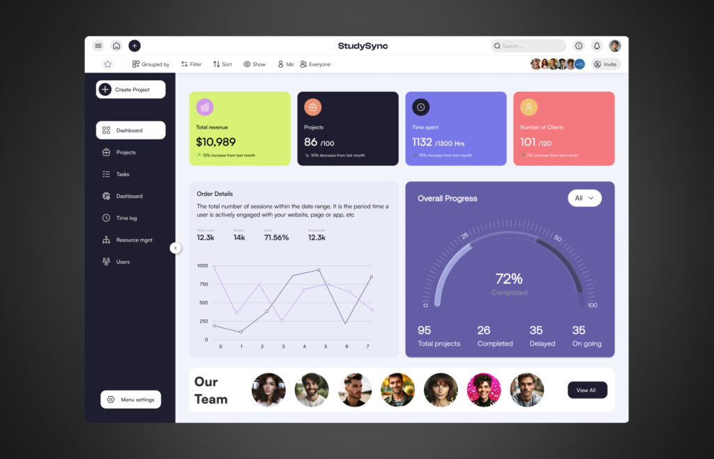
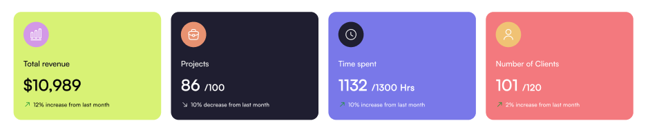
This custom dashboard concept is designed to address the project management needs of any company. It features a unique top bar and a toggleable sidebar for streamlined navigation. At the top, there’s a quick stats section providing an overview of key metrics such as revenue, active projects, hours spent, and the number of clients.
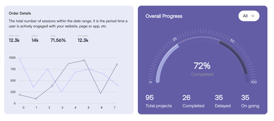
Next, we included a visual representation of order details, utilizing a line chart for clear and effective data visualization. The admin can also view an overall progress summary, including metrics like total completed projects and ongoing projects. Lastly, there’s a dedicated section for team management, ensuring all essential information is easily accessible in one place.
Technical Breakdown with UI/UX Expertise: Designing CRM Dashboards in Figma
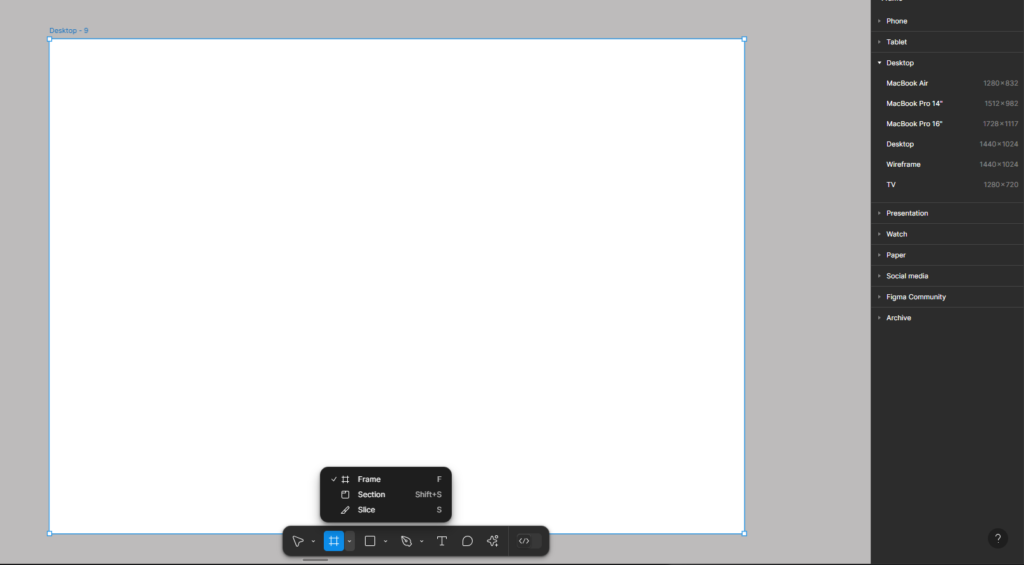
Setting Up the Frame
Start by opening Figma and navigating to the toolbar to select or create a Frame. You’ll find various frame options available, choose the desktop frame if you’re specifically designing for desktop screens. For our design, we created a desktop frame with dimensions of 1440×1024 (width: 1440, height: 1024).
Adding Grid Layout in the Frame
We applied a 12-column grid layout with a centered type. Each column has a width of 100px, and the gutter (the space between two columns) is set to 20px.
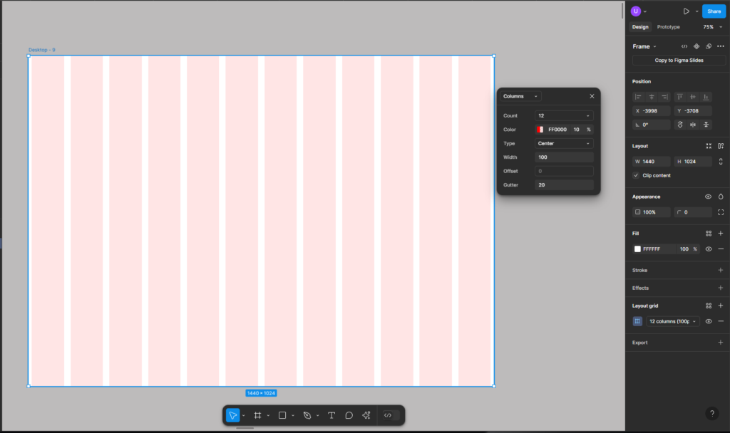
Please note that you can setup the frame and grid as per your own design requirements.
Designing the Navigation and Side Bars for the Custom CRM Dashboard
The navbar is so aesthetically designed that it invites you to explore it further. Let’s explore it.
- We have menu icon on top left that enables sidebar
- Then we have homepage icon
- The “+” icon allows you to pin any menu item or tool to the top navbar for easy access
- Logo in center
- Search bar
- A warning icon that helps you monitor projects that are experiencing delays
- Notification icon (general purpose notifications)
- Lastly, we have this profile icon (e.g. allows you to edit/update profile, logout, theme change)

You can also add projects to your favorites, group them (e.g., by team or project), and filter data or statistics based on criteria such as date range or budget. Additionally, you have the option to invite members to the projects.
Let’s now jump to the side bar of the CRM dashboard.
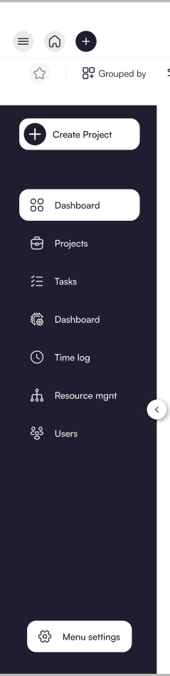
- Option to create new project
- Navigate to dashboard
- Manage/view all projects
- Tasks overview
- Dashboard settings (e.g. layout or color changes)
- See projects time log
- Resource management (e.g. Team management)
- All users
- Menu settings
Please note that we added these nav items as per our research or use-case. You can adjust them as per your business needs/requirements.
Quick Stats of Your Projects – Summary Cards
The cards below display key statistics such as your revenue, projects, time spent, and number of clients.
Visual Representation of Real Time Data in Figma Design
In our CRM Dashboard Figma design, we used a line chart to provide a quick overview of orders. Additionally, a progress chart is utilized to display key stats for total projects, including completed, delayed, and ongoing ones.
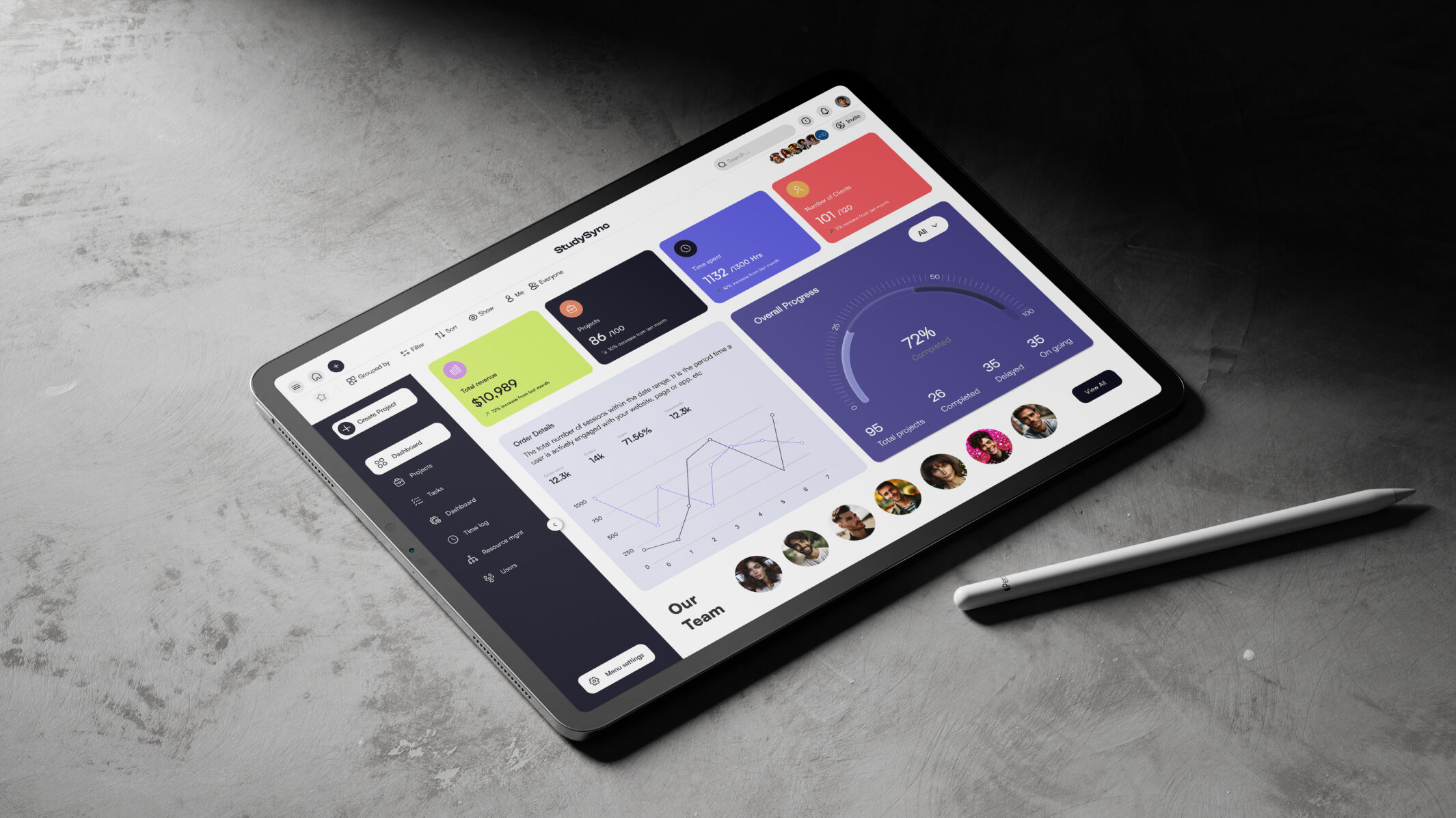
Finally, here’s the team section. Check out the full design/mockup below.
Designing CRM Dashboards in Figma with the User in Mind – The UX Approach
Having covered the fundamentals of design guidelines, let’s now dive into the UX approach for this project and for any future CRM dashboard designs you plan to create.
User-Centered UX Approach
We focused on understanding user needs, including project managers and team leads, to guide the design of the CRM dashboard, ensuring it is intuitive and user-friendly.
Streamlined Navigation
We implemented a clear, organized top navbar and toggleable sidebar, enabling quick access to key sections like project management, tasks, and team resources for easy navigation.
Data Visualization
To enhance data clarity, we utilized line charts and progress charts to provide real-time insights into orders, project status, and key metrics, ensuring users can quickly interpret critical information.
Responsive Design & Performance
The dashboard is optimized for performance, ensuring fast load times and a responsive design across devices, providing a seamless user experience on both desktop and mobile.
Collaboration Features
We included easy-to-use collaboration tools, such as team member invites and task management, streamlining team workflows directly within the dashboard.
Efficient Workflow
With a minimalistic layout and a focus on displaying key stats like revenue, projects, and clients, we created a functional dashboard that keeps users focused on important data.
FAQs
What is More Important, Aesthetics or Functionality?
When it comes to designing a custom CRM dashboard, functionality should always be the top priority, but aesthetics still play a key role. A well-designed interface in Figma should be both easy to use and visually appealing. While a sleek, attractive design can enhance the user experience and make the dashboard more engaging, it’s the functionality that truly matters. A dashboard’s primary goal is to help users manage and analyze their data efficiently. So, it’s about finding the right balance designing a dashboard that’s not only beautiful but also functional and intuitive.
Why is Customization Important for CRM Dashboards?
Customization allows CRM dashboards to be tailored to a company’s unique needs, offering flexibility in how data is presented. With custom designs, businesses can prioritize the metrics and features that matter most, ensuring the dashboard works for them, not the other way around. This personalization leads to better user engagement and efficiency. Our UI/UX designs are thoughtfully crafted with a strong focus on development considerations and constraints. Additionally, we excel in delivering pixel-perfect Figma to HTML/CSS/JS conversions for seamless implementation.
How does Figma Improve the CRM Dashboard Design Process?
Figma enables a collaborative design process where designers and stakeholders can work together in real time, providing instant feedback and adjustments. It streamlines the creation of interactive prototypes and wireframes, ensuring the final CRM dashboard design is both user-friendly and functional before moving to development. Stay updated with our latest designs and tips by following us on Instagram @theui_studio.
Explore Our UI/UX Work and Connect with Us
We believe in sharing our design journey and showcasing our projects across various platforms. You can explore our latest work, get inspired, or connect with us through the following links:
- Behance: Browse our portfolio for in-depth project showcases.
- Instagram: Stay updated with our latest designs and creative processes.
- LinkedIn: Connect with us professionally and discover our industry expertise.
- Website: Visit our website for more about our services and offerings.
Feel free to reach out and engage with us on any platform, or comment below here on the blog! We’d love to hear from you!