The real estate SaaS market is rapidly expanding across the globe. We had the opportunity to collaborate with a forward-thinking company offering a comprehensive platform for property listings, searches, and more, serving both realtors and end consumers. Their goal was to revamp the user interface and enhance the overall user experience of their existing web portal (we already shared how we revamped their portal chat experience) and mobile app. With their original designs provided in Figma, they entrusted our UI/UX design agency to take the lead. Our Figma design expert thoroughly analyzed the existing layouts, identified key UX shortcomings, and set out to deliver a modern, intuitive redesign for their SaaS real estate chat app.
Analyzing the Real Estate Chat UI/UX: Key Shortcomings and Improvements
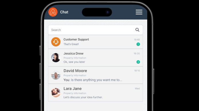
Real Estate SaaS App – Old Chat Module: Home Screen
Lack of Visual Hierarchy
- The old design shows a list of chats with minimal distinction between key elements like names, messages, and timestamps.
- Important details (e.g., unread messages or active chats) don’t visually stand out, leading to a cluttered look.
Poor Readability & Text Clarity
- Text sizing and spacing were tight, making it harder for users to quickly scan through conversations.
- Message previews are cut off abruptly without any consistent line height or padding.
Inconsistent Avatar Sizes & Styles
- Profile pictures lacked consistency in styling and size, making the interface feel less polished and professional.
Overloaded Chat Metadata
- The old version had small, repetitive labels (like “Property information”) that added noise rather than value.
- Status indicators and chat metadata (e.g., time, support icons) were visually noisy and distracted from the primary content.
Outdated Aesthetic
- The interface used outdated icons and spacing patterns, and lacked a modern, clean UI style that’s expected in current SaaS apps.
How Our New UI/UX Design for the Real Estate Chat App Addressed These Issues
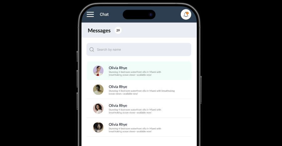
Real Estate SaaS App – Updated Chat Module: Home Screen
Improved Typography & Readability
- The updated design uses larger, clearer fonts and better line spacing, making it easier to skim conversations at a glance.
Cleaner Visual Hierarchy
- Bold names, clean message previews, and subtle timestamps help users focus on what matters most.
- Each chat card has a clear separation, improving scan-ability and reducing visual fatigue.
Refined User Avatars
- Consistent, rounded avatars contribute to a sleek and modern appearance.
- Highlighted or active chats are now clearly emphasized with a background highlight.
Modern UX Elements
- The search bar is visually prominent and easier to use.
- A notification icon adds functional depth, aligning with current UX expectations.
Minimalist & Scalable Design
- The new layout follows a minimalist approach, ensuring better scalability across devices and consistent user experience.
Real Estate App: Chat Inbox Screen – Old vs. New UI/UX
How Does the Existing Chat Inbox Screen Look Like?
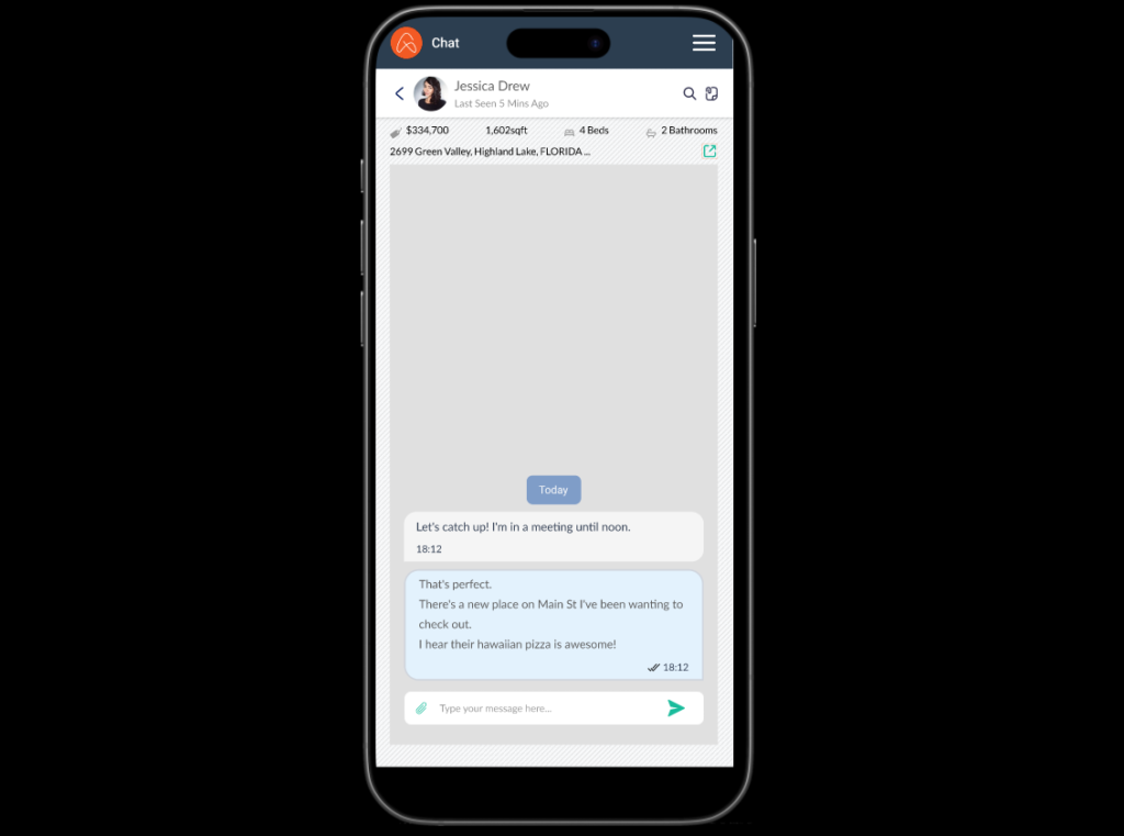
Lack of User Status: The old design only shows the last seen time (“Last Seen 5 Mins Ago”). This doesn’t give a real-time sense of the user’s availability.
Missing Key Actions: The old design lacks quick access to important actions like accessing files or property information directly from the chat screen.
Visual Clutter: The old design feels a bit more cluttered. The property details (price, sqft, beds, baths) are prominently displayed but could be more streamlined.
Inconsistent Icons: The icons used in the old design seem a bit dated and less consistent with modern UI trends.
What Improvements Were Introduced in the New UI/UX for the Real Estate Chat Inbox Screen?
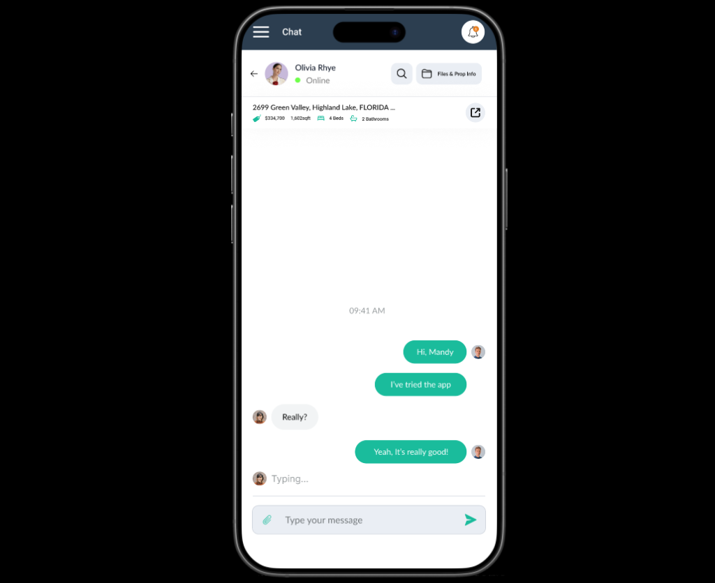
Real-time User Status: The new design shows a clear “Online” status, providing immediate information about the user’s availability for a conversation.
Direct Access to Files & Property Info: The “Files & Prop Info” button provides a direct and convenient way to access relevant documents and details related to the property being discussed.
Cleaner Interface: The new design has a cleaner and more modern look. The property details are still present but presented in a less overwhelming way.
Modern Iconography: The new design uses more modern and consistent icons, contributing to a more polished and professional feel.
Notification Bell: The addition of the notification bell icon allows users to quickly see if they have any unread notifications.
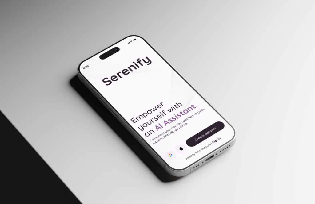
If you’re looking for an AI chatbot for your next SaaS application, check out our expertly designed and intuitive AI chatbot UI/UX. We also specialize in custom UI/UX design solutions such as the therapeutic AI voice chat app we designed for a client in Toronto, Canada.
Explore Our UI/UX Work and Connect with Us
We believe in sharing our design journey and showcasing our projects across various platforms. You can explore our latest work, get inspired, or connect with us through the following links:
- Behance: Browse our portfolio for in-depth project showcases.
- Instagram: Stay updated with our latest designs and creative processes.
- LinkedIn: Connect with us professionally and discover our industry expertise.
- Website: Visit our website for more about our services and offerings.
Feel free to connect with us on any platform or leave a comment below, we’d love to hear your thoughts!
You can also reach us directly at info@theuistudio.com.