Smart companies are revolutionizing how we commute daily, embracing innovation to reduce fossil fuel dependency and make city travel smarter. One standout example is Acer’s ebii, an AI-driven smart bike designed for urban commuters, which recently won the prestigious Good Design Award 2023. But a cutting-edge product like this isn’t complete without a mobile app that elevates the experience e.g. tracking trips, monitoring performance, enabling smart locking, and more. That’s where our UI/UX design expertise comes in, delivering seamless, user-friendly interfaces to complement and enhance the smart cycling experience.
In today’s article, we’ll share a UI/UX design concept for a smart AI bicycle app. Let’s dive into the screens we designed in Figma and explore the design strategy and system our experts used to craft this concept.
Smart AI Bicycle Mobile App UI/UX Design
Our latest design mockup for a smart AI bicycle app offers an intuitive interface that enhances the riding experience for both casual and avid cyclists. Here’s a closer look at the three UI/UX screens designed in Figma.
Welcome Screen: Built for Riders, Not Drivers
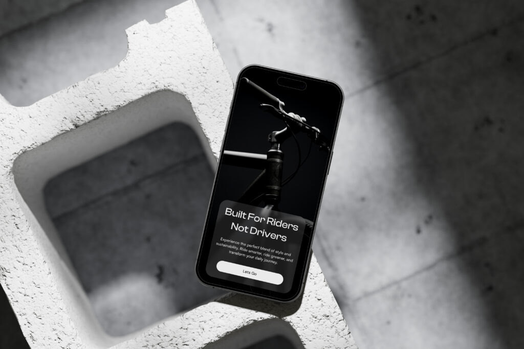
The journey begins with a welcoming screen that immediately captures the essence of our smart bicycle. The tagline, “Built For Riders Not Drivers,” sets the tone, emphasizing a community-focused approach. The minimalist design, with its clean lines and ample white space, ensures that users are not overwhelmed. The prominent “Learn More” button invites users to explore the app further, creating an engaging entry point.
Product Showcase: The Cruiser
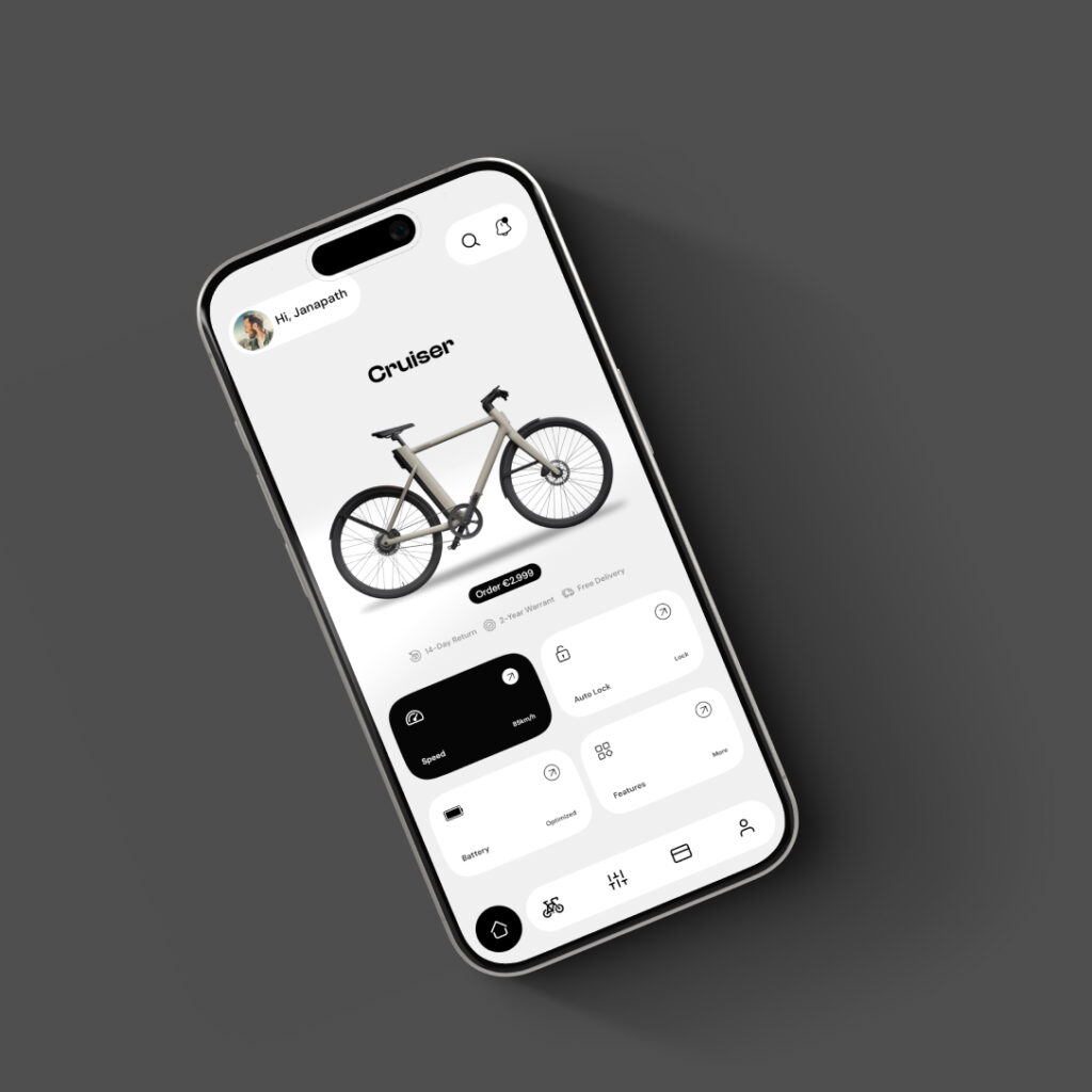
The second screen showcases the Cruiser bicycle, highlighting its features and benefits. The layout is visually appealing, allowing users to appreciate the design and functionality of the bike. High-quality images paired with essential details draw attention to the bike’s specifications and unique selling points. This screen is designed to foster a connection between the user and the product, making it easy to understand why this bicycle stands out in the market.
Activity Tracking: Stay Engaged and Informed
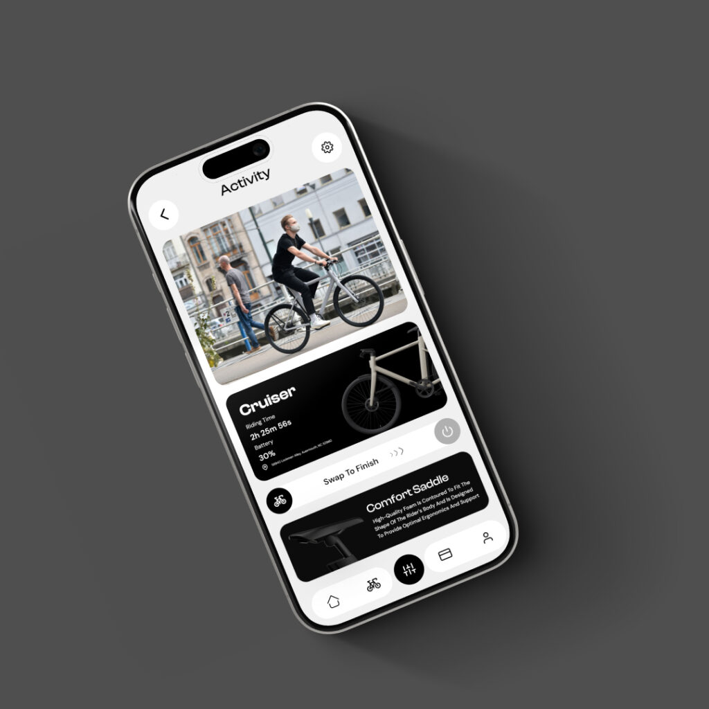
The final screen focuses on user activity, providing insights into rides and performance. This feature is crucial for cyclists who want to track their progress and stay motivated. The dashboard-style layout presents information in a digestible format, allowing users to quickly assess their stats. The use of icons and color coding enhances usability, making it easy to identify key metrics at a glance.
Design Details of the Smart AI Bicycle App UI/UX
Let’s explore the technical aspects of this smart AI bicycle mobile app UI/UX design in Figma.
Color Palette & Font Selection
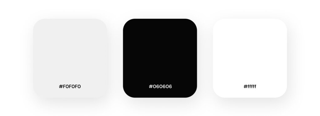
Our designers chose a striking color palette of black, white, and light gray to create a sleek and modern aesthetic for the app. This minimalist approach enhances the user interface, ensuring clarity and focus on essential features. For typography, we utilized Clash Display for headings, which adds a bold and contemporary flair, while DM Sans serves as the body font, offering excellent readability. Together, this combination not only promotes legibility but also aligns perfectly with the app’s contemporary feel, appealing to tech-savvy cyclists who value both style and functionality.
Smart AI Bicycle App Navigation bar Design
The navigation bar features a clean and minimalist design, emphasizing ease of use and quick access to essential functions. Here are the details:
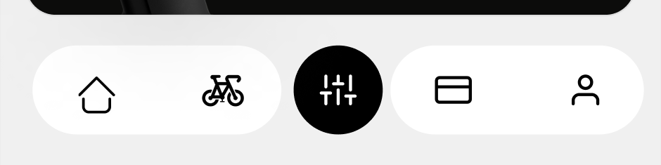
- Icon Arrangement: The navigation bar consists of four primary icons, spaced evenly for a balanced look.
- Icons:
- Home Icon: This represents the main dashboard, allowing users to return to the home screen quickly.
- Bicycle Icon: This icon likely provides access to cycling-specific features, such as routes or bike settings.
- Activity Icon: Positioned centrally, this icon serves as a hub for tracking daily activities.
- Subscription Icon: Can subscribe for additional features.
- User Icon: This represents user profile access, allowing users to manage their accounts and personal information.
- Color Scheme: The icons are rendered in a simple, monochromatic style that aligns with the app’s overall color palette of black, white, and light gray. This enhances visibility and ensures that the navigation bar remains visually cohesive.
- User-Centric Design: The choice of icons is intuitive, making it easy for users to understand their functions at a glance. The minimalist design reduces clutter, allowing for a focused and streamlined user experience.
Overall, this navigation bar is designed to facilitate smooth navigation while maintaining a modern and appealing aesthetic.
Layout Grid System
The grid system we’ve implemented is a foundational element of our app’s design, providing structure and consistency across various screens. Here are some key aspects:
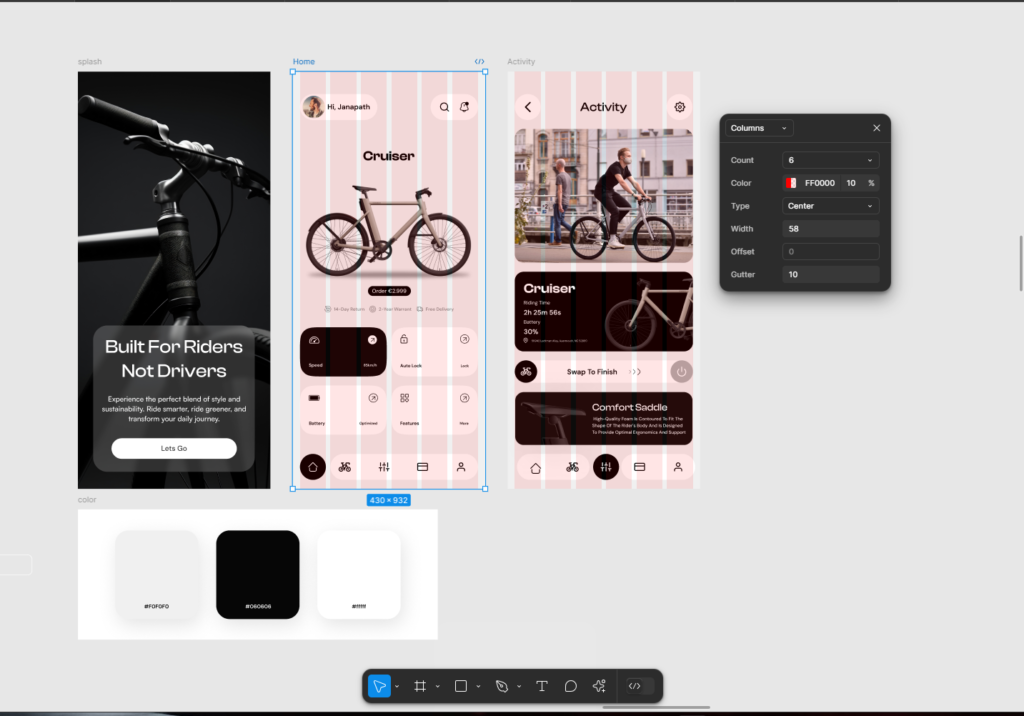
- Column Layout: The grid is organized into a flexible column structure, which allows for responsive design. This means that the app looks great and functions well on a variety of screen sizes, ensuring an optimal user experience whether on a smartphone or a tablet. We used 6 columns with column width 60px.
- Alignment and Spacing: By using a defined gutter and consistent offsets, we ensure that elements are well-aligned and spaced evenly. This not only enhances visual appeal but also improves usability by making it easier for users to scan and interact with content. Column type is center and gutter spacing (space between two columns) is 10px.
- Visual Hierarchy: By organizing content within the grid, we can create a clear visual hierarchy. Important elements stand out, guiding users through the app naturally. This is particularly important for features like the splash screen and activity feeds, where user engagement is key.
Overall, the grid system serves as the backbone of our app’s design, facilitating a user-friendly experience while maintaining a modern and polished aesthetic.
FAQs
What features should a mobile app for a smart AI bicycle include?
A smart AI bicycle app should include features such as trip tracking, performance monitoring, smart locking, charging status, and a user-friendly interface for seamless interaction. Our concept design also emphasizes intuitive navigation, activity tracking, and product showcase screens to enhance user experience.
How does the grid system improve the app’s UI/UX design?
The grid system provides a structured layout that ensures visual consistency and alignment across screens. By organizing elements with a 6-column layout and defined spacing, the design achieves clarity, responsiveness, and a clear visual hierarchy, making it easier for users to engage with the app.
Why is Figma the preferred tool for designing smart bicycle apps?
Figma is ideal for creating scalable and collaborative designs. It allows designers to prototype, test, and iterate efficiently, ensuring the app meets both user needs and aesthetic goals. In our project, Figma enabled us to craft a sleek, modern design tailored for smart bicycle users.
Elevate Your App with Expert UI/UX Design
Looking to create a user-friendly and visually striking app for your smart gadget? Our UI/UX design experts specialize in delivering intuitive designs that enhance functionality and user engagement. From concept to execution, we ensure your app stands out and meets the needs of your audience.
Reach out to us at info@theuistudio.com to schedule a meeting and bring your app idea to life with exceptional design!
Explore Our UI/UX Work and Connect with Us
We believe in sharing our design journey and showcasing our projects across various platforms. You can explore our latest work, get inspired, or connect with us through the following links:
- Behance: Browse our portfolio for in-depth project showcases.
- Instagram: Stay updated with our latest designs and creative processes.
- LinkedIn: Connect with us professionally and discover our industry expertise.
- Website: Visit our website for more about our services and offerings.
Feel free to reach out and engage with us on any platform, or comment below here on the blog! We’d love to hear from you!