We’re excited to share another successful project: our collaboration with Minneapolis Landlords! We had the privilege of redesigning UI/UX in Figma for their website, making it more user-centric, engaging, and visually appealing.
But that’s not all, we also crafted a brand-new logo, giving their brand a fresh and modern identity. We didn’t just redesign the website; we delivered an outstanding logo that perfectly aligns with their brand name. The coherence between the website and logo makes the Minneapolis Landlords website stand out in a competitive market!
In this blog, we’ll walk you through our UI/UX redesign process in Figma for this Minneapolis real estate listing platform. The best part? Our UI/UX experts completed this transformation in just two days! Keep reading to see how we elevated both the visual identity and user experience of their platform.
UI/UX Redesign in Figma – Minneapolis Landlords Website Case Study
Before we dive into the redesign, let’s talk about what Minneapolis Landlords is all about. Minneapolis Landlords is a platform dedicated to guiding property owners, investors, and renters through the Twin Cities multifamily real estate market. Whether you’re looking to buy, sell, or manage rental properties, the platform provides expert insights and seamless transaction support to save time and maximize returns.
From property listings to market analysis and investment strategies, Minneapolis Landlords simplifies the real estate journey, making it easier for landlords and investors to make informed decisions. However, while their expertise in real estate was top-notch, their website needed a modern, user-friendly UI/UX to truly reflect their mission. That’s where The UI Studio came in!
Identifying the Key Issues in the Old Design
Why This Hero Section Falls Short: A UI/UX Analysis

Overcrowded Text
The hero section contains a lot of text, which can overwhelm users.
Lack of Visual Hierarchy
The text doesn’t have a clear hierarchy, making it hard for users to know where to focus first.
Confusing Call to Action (CTA)
The CTA (“Get Started”) may not be immediately clear about what action users should take.
Background Image Clarity
While the image of the city is visually appealing, it may distract from the text.
Inconsistent Branding
The color scheme and font choices may not align well with the overall branding.
Limited Accessibility
Text contrast against the background may not meet accessibility standards, making it hard for some users to read.
Lack of User Engagement Elements
There are no engaging elements, such as images of happy customers or testimonials, that can build trust.
Enhancements in the Minneapolis Landlords Website Hero Section: A Step Forward
We’re excited to unveil our updated hero section, designed to provide a more engaging and user-friendly experience for our visitors. Here’s a breakdown of how this new design improves upon the previous version.
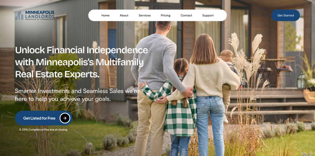
Simplified Messaging
The updated hero section features concise and impactful messaging. By streamlining the text, we focus on our core value proposition: helping clients achieve financial independence through multifamily real estate investments. This clarity allows visitors to quickly grasp what we offer and how we can assist them.
Clear Visual Hierarchy
The new design employs a clear visual hierarchy, guiding users’ attention to the most important elements. The primary message stands out prominently, making it easier for visitors to understand our mission at a glance. This enhancement improves overall readability and engagement.
Engaging Call to Action
Our call to action has been revamped to be more specific and inviting. “Get Listed for Free” is a direct and actionable phrase that encourages users to take the next step. This clarity helps users understand precisely what they can do and what to expect.
Inviting Imagery
The background image features a warm, inviting scene with families, creating an emotional connection. Unlike the previous design, which may have been distracting, this imagery complements the text and reinforces our focus on community and family-oriented investment opportunities.
Brand Consistency
The updated design aligns more closely with our brand identity, using colors and fonts that reflect our values and mission. This consistency not only enhances aesthetics but also builds trust with our audience.
Improved Accessibility
We’ve taken accessibility into account by ensuring sufficient contrast between text and background, making it easier for all users to read and engage with our content. This commitment to inclusivity demonstrates our dedication to serving a diverse audience.
User Engagement Elements
The new hero section incorporates elements that foster user engagement, like imagery of happy families and a clear financial incentive. By showcasing these aspects, we aim to build trust and encourage potential clients to take action.
Property Listing Section UI/UX Issues in Old Website
Take a look at the old user interface of the price listing section.
Cluttered Layout
The design appears overcrowded, overwhelming users with excessive text that obscures the main message.
Lack of Visual Hierarchy
Key information is not highlighted effectively, making it difficult for users to identify important selling points quickly.
Ineffective Call to Action
The call to action is not prominently displayed, reducing its ability to encourage users to take the next step.
Absence of Engaging Visuals
The design lacks compelling images or graphics that could enhance user interest and build trust.
Inconsistent Branding
The color scheme and font choices do not align well, detracting from brand cohesion and leaving users uncertain about the company’s identity.
Limited Accessibility
There are no considerations for accessibility, such as adequate contrast and font sizing, which limits usability for a broader audience.
Overall Ineffectiveness
These issues contribute to a less effective property listing experience that may deter potential clients.
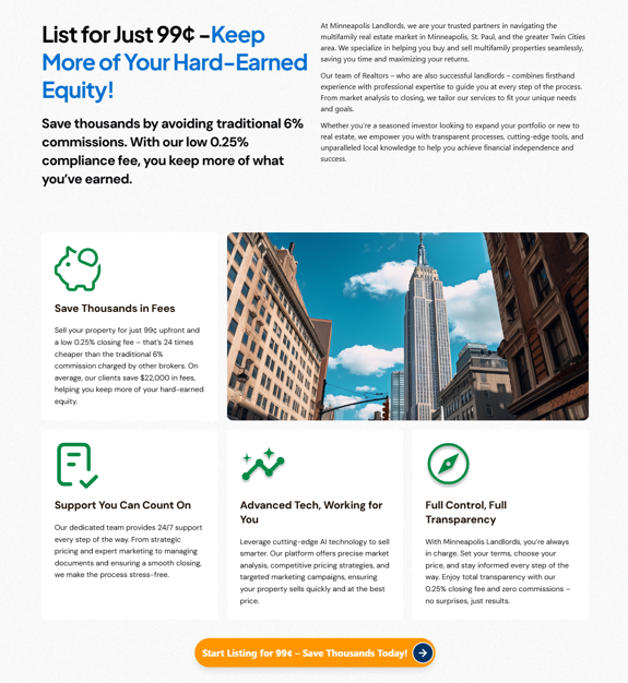
Updated UI/UX for the Property Listing Section – Real Estate Website
The updated UI/UX for the property listing section demonstrates significant improvements that enhance user experience and engagement.
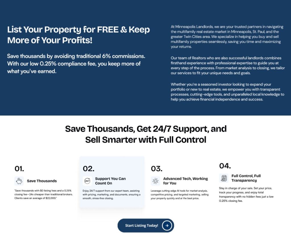
Clean and Organized Layout
The new design features a more streamlined layout, reducing clutter and allowing users to focus on essential information without feeling overwhelmed.
Clear Visual Hierarchy
With a well-defined visual hierarchy, important points are highlighted effectively, making it easy for users to identify key benefits and selling propositions quickly.
Prominent Call to Action
The call to action, “Start Listing Today,” is clearly displayed, encouraging users to take immediate action and enhancing the likelihood of engagement.
Engaging and Relevant Visuals
The inclusion of visuals that support the text not only captures users’ attention but also builds trust by illustrating the company’s professionalism and approach.
Consistent Branding
The updated design maintains a cohesive color scheme and typography that aligns with the brand’s identity, reinforcing trust and familiarity with users.
Accessibility Considerations
The new layout incorporates better contrast and readability, ensuring that the content is accessible to a wider audience, including those with visual impairments.
Enhanced User Control and Transparency
The updated section emphasizes user control and transparency, assuring potential clients that they will have the necessary support and information to make informed decisions.
Overall, these improvements create a more inviting, efficient, and effective property listing experience, ultimately encouraging potential clients to engage with the services offered.
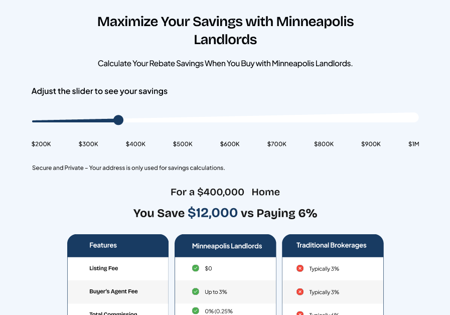
Improved UI/UX for the Saving Calculator
The new UI/UX for the savings calculator is highly effective and user-friendly, allowing for intuitive interaction through an adjustable slider. This feature enables real-time calculations, enhancing engagement. A clear comparison between Minneapolis Landlords and traditional brokerages highlights the benefits of our services. Emphasizing security and privacy builds user confidence, making this design a powerful tool for informed decision-making. Overall, it effectively communicates value while prioritizing ease of use.
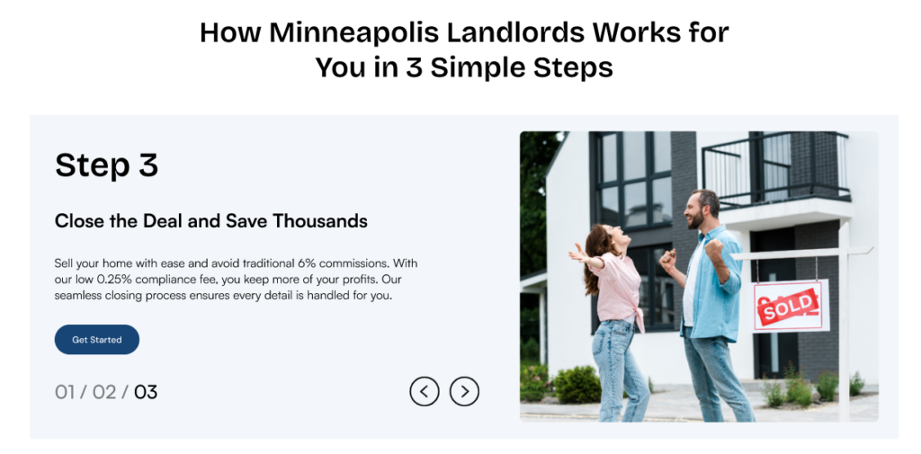
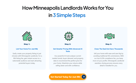
UI/UX Redesigning in Figma – Explaining How the Website Works
The new UI/UX for the “How Minneapolis Landlords Works for You” section is a marked improvement over the old design. It features a dynamic carousel that allows users to navigate through the steps interactively, enhancing engagement. The use of relevant imagery in Step 3 creates an emotional connection, making the process feel more relatable. Additionally, the clearer layout and larger text improve readability, while the prominent call to action encourages users to take the next step effectively. Overall, the new design is more engaging, visually appealing, and user-friendly, making it easier for users to understand the benefits of the service.
Take a look at the old design below:
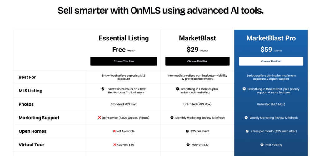
Updated Pricing Section UI/UX for the Real Estate Website
The new pricing UI/UX is a significant improvement over the old design for several reasons:
- Clarity and Organization: The new layout presents pricing plans in a clear, side-by-side format, making it easier for users to compare options at a glance. The old design, while informative, feels more cluttered and less organized.
- Visual Appeal: The updated design employs a modern aesthetic with bold colors and clear headings that enhance visual hierarchy. This makes it more inviting and engaging for potential users.
- Descriptive Labels: Each plan in the new UI is accompanied by straightforward labels like “Essential Listing,” “MarketBlast,” and “MarketBlast Pro.” This helps users quickly understand the purpose and benefits of each option, unlike the more generic labels in the old UI.
- Feature Highlights: The new design effectively highlights key features and benefits associated with each plan, making it easier for users to identify which plan best suits their needs. The old design lacks this emphasis, making it harder for users to grasp the advantages of each option.
- Call to Action: The new UI includes prominent buttons for selecting plans, encouraging user interaction. The old design’s calls to action are less visually prominent, which may hinder user decision-making.
Old pricing section:
Overall, the new pricing UI/UX is more user-friendly, visually appealing, and effective in communicating the value of each plan, ultimately enhancing the user experience and facilitating informed decision-making.
Client Reviews: Success Stories from the Upgraded Minneapolis Website UI/UX
Our client expressed overall satisfaction with the upgraded Minneapolis website design. They appreciated the intuitive navigation and modern aesthetics, which significantly improved user engagement. The enhanced features, such as the dynamic pricing section and interactive step-by-step guides, were particularly well-received. The client noted that the new design not only meets their needs but also elevates their brand image, making it easier for users to access vital information and encouraging them to take action. Overall, the successful implementation of the new UI/UX has strengthened their confidence in our ability to deliver effective solutions.
FAQs
What improvements were made in the new Minneapolis website UI/UX?
The upgraded design features a more intuitive layout, dynamic navigation elements, and visually appealing sections that enhance user engagement. Key improvements include a step-by-step guide for users and a clear, organized pricing section that simplifies decision-making.
How does the new design benefit users?
The new UI/UX is designed to make information more accessible and engaging. Users can easily navigate through processes, compare pricing plans, and interact with the content, which ultimately helps them make informed decisions and enhances their overall experience.
What feedback has been received from clients about the upgrade?
Clients have expressed high satisfaction with the new design, noting its modern aesthetics and improved functionality. The responsive features and clear calls to action have been particularly praised for enhancing user interaction and elevating the brand’s image.
How do I Get Started with a UI/UX Redesign for my Website or App?
Simply reach out to us at info@theuistudio.com! Share your vision, and our team will analyze your current design, suggest improvements, and create a tailored UI/UX strategy that aligns with your goals. Let’s build something amazing together!
We don’t just design UI/UX; we also ensure pixel-perfect development. Our backend engineers are dedicated to enhancing user experience while focusing on system development and optimization. Below are some of our recent deliveries:
- Domaingler – Custom UI/UX and pixel perfect development
- PWA (progressive web app) for an ISP (internet service provider) company – UI/UX and pixel perfect development
- The UI Studio – Portfolio website
Explore Our UI/UX Work
We believe in sharing our design journey and showcasing our projects across various platforms. You can explore our latest work, get inspired, or connect with us through the following links:
- Behance: Browse our portfolio for in-depth project showcases.
- Instagram: Stay updated with our latest designs and creative processes.
- LinkedIn: Connect with us professionally and discover our industry expertise.
- Website: Visit our website for more about our services and offerings.
Feel free to reach out and engage with us on any platform, or comment below here on the blog! We’d love to hear from you!