After crafting an intuitive and visually engaging property search screen for a real estate company in Florida, the next natural step in the user journey is viewing the details of a specific property. This is where design truly meets storytelling, the Property Details screen.
It’s not just about listing facts, the Property Details page should help users emotionally connect with the space, giving them everything they need to make an informed decision and take the next step.
In this blog, We’ll walk you through the UI/UX design process of the Property Details screen in Figma, how our team balanced aesthetics with function, structured content for clarity, and ensured seamless interaction. If you haven’t yet seen the Property Search Screen design, we recommend starting there to understand how the entire flow comes together.
Designing Property Details Screen UI/UX in Figma
This screen will allow users to review:
- Property gallery
- Facilities (e.g. bedrooms, bathrooms)
- Location
- Interior & Appliances
- Kitchen
- Parking
- Construction type (e.g. new, old, Modern)
- Similar homes
Let’s explore the design in depth.
Property Details Screen Navbar Design

The top navigation bar on the Property Details screen is designed to be minimal, intuitive, and action-oriented. On the left, a clear “Back to Search” button allows users to easily return to their search results without losing their place in the browsing flow. At the center, the brand name is displayed prominently but unobtrusively, reinforcing brand identity while maintaining a clean visual hierarchy. To the right, key actions such as Save, Share, Report Listing, and a More dropdown are grouped together for easy access. These options are thoughtfully prioritized to align with common user behavior, allowing users to interact with the property listing without feeling overwhelmed. The overall layout ensures that navigation remains straightforward and familiar, supporting a seamless user experience.
Property Details Screen Gallery Design
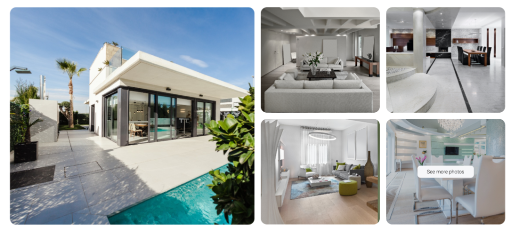
The property gallery features a large hero image alongside a grid of interior shots, offering a quick visual overview of the space. Clean spacing, rounded corners, and a “See more photos” call-to-action create a modern, inviting layout that encourages users to explore further without overwhelming them.
How See More Photos Work?
Clicking on ‘see more photos’ will open images in a slider view.
Property Location, Price and Other Details
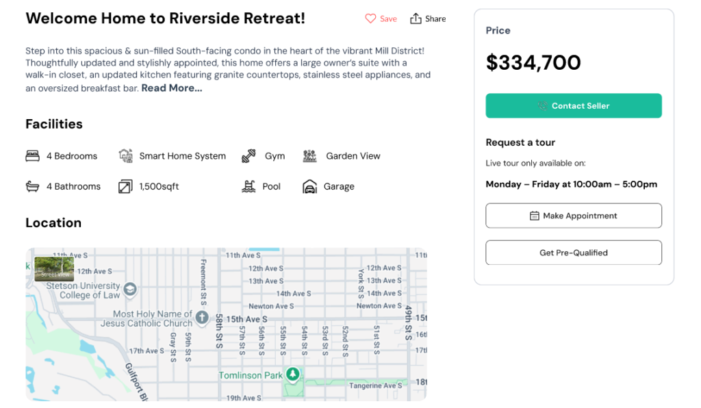
There is also option to save/share the property. Saved properties can be viewed in save/favorite properties section.
Property Overview
The “Riverside Retreat” welcomes users with a warm, descriptive headline and a brief introduction that paints a lifestyle picture rather than just listing features. The use of bold typography and clean spacing creates a visually accessible experience that aligns with a modern UI/UX aesthetic.
Facilities at a Glance
Icons paired with text provide an intuitive and scannable list of amenities, including bedrooms, bathrooms, smart home systems, and more. The consistent visual style makes it easy for users to digest information at a glance.
Location Integration
The embedded map supports user trust by showing the exact neighborhood and nearby landmarks. This transparent placement of location strengthens the decision-making process and adds real-world context.
Action-Oriented Sidebar
On the right, the price is clearly presented alongside high-contrast call-to-action buttons like “Contact Seller,” “Make Appointment,” and “Get Pre-Qualified.” The layout guides the user naturally from exploration to action, improving conversion through thoughtful UX design.
This action-oriented sidebar remains fixed as the page scrolls, ensuring the CTA option stays visible and clear to the user.
Suggesting Similar Homes
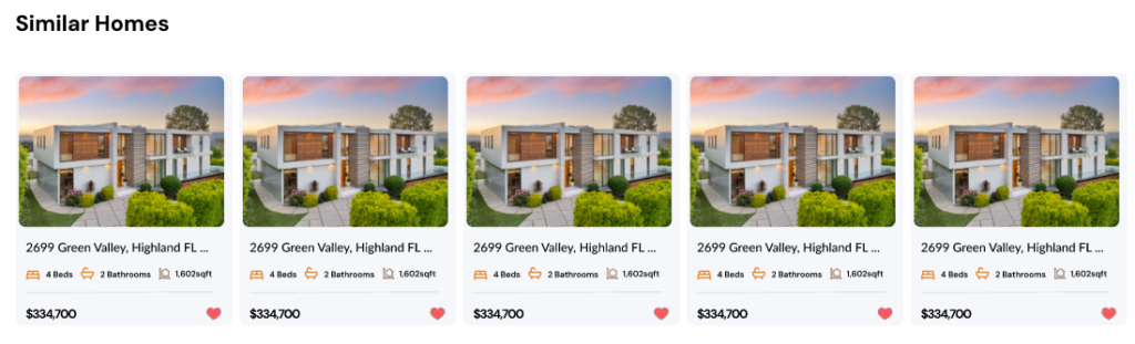
This section helps user to further explore related properties. User can scroll them horizontally.
Explore Our UI/UX Work
We believe in sharing our design journey and showcasing our projects across various platforms. You can explore our latest work, get inspired, or connect with us through the following links:
- Behance: Browse our portfolio for in-depth project showcases.
- Instagram: Stay updated with our latest designs and creative processes.
- LinkedIn: Connect with us professionally and discover our industry expertise.
- Website: Visit our website for more about our services and offerings.
Feel free to reach out and engage with us on any platform, or comment below here on the blog! We’d love to hear from you!
Get your next UI project done, contact us at info@theuistudio.com.