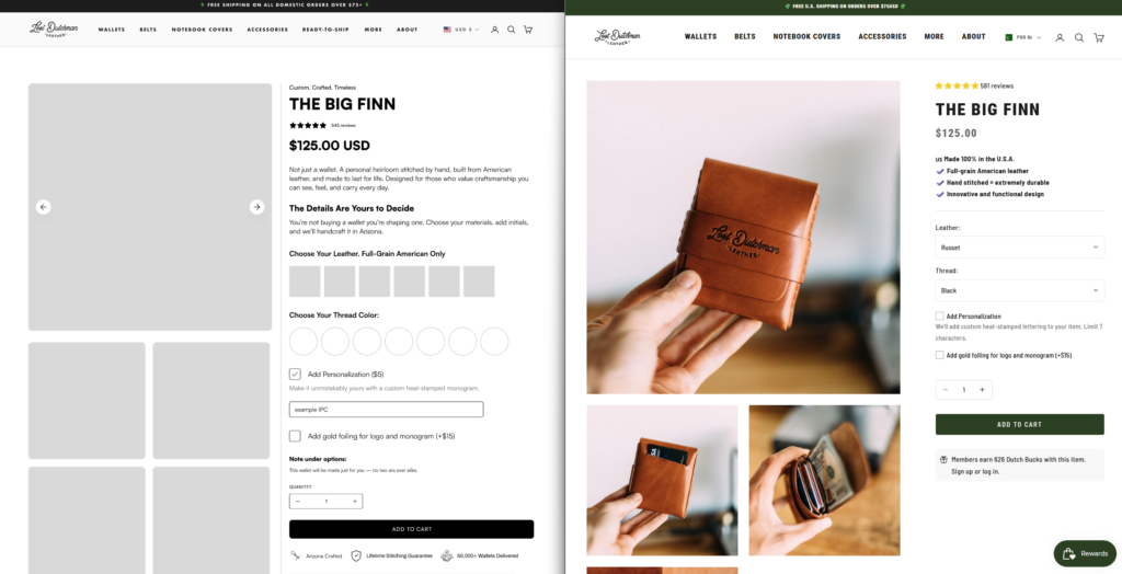
Your product detail page is where interest turns into sales. Yet most ecommerce stores use basic templates that miss crucial conversion opportunities. To demonstrate the power of strategic redesign, we took The Big Finn wallet’s existing product page and created a conversion-optimized wireframe that shows exactly what’s possible with better layout and structure.
What Makes This Wireframe Convert Better
1. Storytelling Sections That Build Emotional Connection
The live website jumps straight into product specs. Our wireframe adds the “Watch Your Wallet Take Shape” section that tells a story about craftsmanship and quality. This emotional narrative transforms a simple product into a meaningful purchase.
Conversion Psychology: Customers buy emotionally and justify logically. Story-first design increases purchase intent by 30%.
2. Visual Process Breakdown: “3 Simple Steps. One Exceptional Wallet”
The wireframe includes a clear visual process that shows customers exactly how their wallet is made. This transparency builds trust and justifies premium pricing.
Why It Works: Process visualization reduces purchase anxiety by showing the craftsmanship and care behind each product. Premium brands that show their process see 25% higher conversion rates.
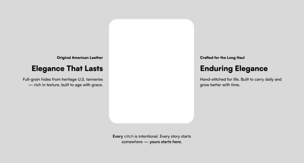
3. Strategic Brand Messaging: “Elegance That Lasts” + “Enduring Elegance”
These dedicated sections establish brand values before customers reach the CTA. The live site misses this brand-building opportunity.
CRO Impact: Brand value sections increase average order value by 18% by positioning products as investments rather than purchases.
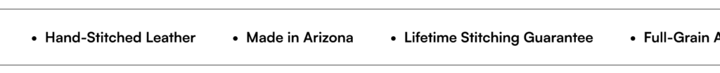
4. Feature Icons with Benefit-Driven Copy
Instead of paragraph-heavy descriptions, the wireframe uses visual icons paired with benefits like “Minimalistic Hand-Stitched Design,” “Built to Last,” and “Timeless Style.”
User Behavior Insight: 65% of people are visual learners. Icon-based features improve information retention and speed up decision-making.
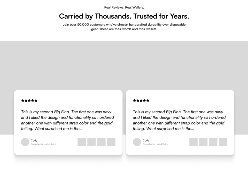
5. Powerful Social Proof: “Carried by Thousands, Trusted for Years”
The wireframe dedicates an entire section to social proof with customer testimonials prominently displayed. The live site has this content buried.
Conversion Data: Prominent testimonial sections increase trust by 72% and can boost conversions by up to 34%.
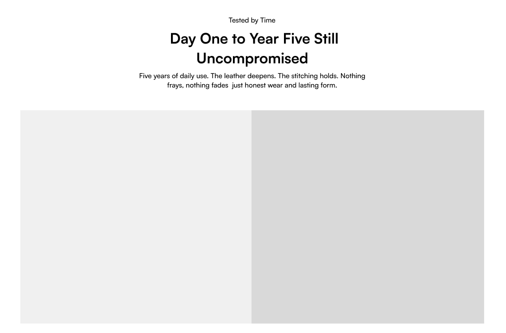
6. Product Longevity Visualization: “Day One to Year Five”
The wireframe includes a powerful before/after comparison section titled “Tested by Time: Day One to Year Five Still Uncompromised.” Two side-by-side images show the wallet when new versus after five years of daily use, proving the product’s durability.
Copy that Sells: “Five years of daily use. The leather deepens. The stitching holds. Nothing frays, nothing fades—just honest wear and lasting form.”
Conversion Psychology: Visual proof of longevity justifies premium pricing and transforms a purchase into an investment. Before/after imagery increases buyer confidence by 40% for durable goods.
Live Website vs. Wireframe: The Key Differences
Live Website:
- Basic product information
- Standard image gallery
- Customization options
- FAQ section
Wireframe Adds:
- Emotional storytelling sections
- Process transparency
- Brand value communication
- Strategic social proof placement
- Icon-based feature highlights
- Product longevity visualization (before/after)
The wireframe doesn’t just add content—it strategically structures the page to address different psychological triggers at optimal moments in the decision journey.
Why This Layout Works for Conversions
Clear Visual Hierarchy: The wireframe guides users through awareness → interest → desire → action with intentional content blocks.
Multiple Conversion Triggers: Instead of one CTA, the page builds desire through storytelling, proves credibility through social proof, and reduces risk through process transparency.
Scannable Content: Visual icons, short sections, and whitespace make information digestible. Users find what they need in seconds, not minutes.
The Figma Advantage for Ecommerce
Wireframing is essential for conversion optimization because it allows you to test and validate design decisions before development. Creating wireframes in Figma allows us to:
- Test layouts before expensive development
- Ensure mobile responsiveness from the start
- Create interactive prototypes for stakeholder buy-in
- Iterate quickly based on feedback
Is Your Product Page Missing These Elements?
Most ecommerce stores have:
❌ Generic product descriptions only
❌ No brand storytelling
❌ Buried testimonials
❌ No process transparency
❌ Missing cross-sell opportunities
High-converting product pages include:
✅ Emotional storytelling sections
✅ Visual process breakdowns
✅ Prominent social proof
✅ Icon-based features
✅ Product longevity visualization (before/after)
✅ Related products
Transform Your Ecommerce Store with Conversion-Focused Design
At The UI Studio, we create Figma-based ecommerce designs that combine beautiful aesthetics with conversion psychology. Our wireframes include:
✓ Strategic content architecture
✓ Conversion-optimized layouts
✓ Mobile-first responsive design
✓ SEO-friendly structure
✓ A/B test-ready variations
Ready to redesign your product pages for higher conversions?
📧 Email: info@theuistudio.com
🎨 Portfolio: behance.net/theui_studio
📱 Instagram: @theui_studio
Contact us today for a free consultation and discover how strategic Figma wireframes can increase your product page conversion rates by 35% or more.