When building a mobile app, the navigation bar (navbar) plays a critical role in defining the user experience. It’s often the first touchpoint users interact with and sets the tone for the app’s usability. A well-designed navbar doesn’t just guide users—it establishes brand identity, ensures accessibility, and creates a seamless flow between app sections.
At The UI Studio, we’ve seen firsthand how small design choices in a navbar can make or break an app’s overall feel. Let’s break down what makes a strong navbar and how pixel-perfect development ensures your design transitions flawlessly from Figma to production.
Why Mobile App Navbars Matter
Think of the navbar as your app’s compass. If it’s intuitive, users will find their way without thinking twice. If it’s cluttered or inconsistent, frustration builds quickly. A good navbar should:
- Be simple and predictable
- Highlight the most important sections of the app
- Adapt well across devices and screen sizes
- Support accessibility with readable icons, contrast, and touch-friendly areas
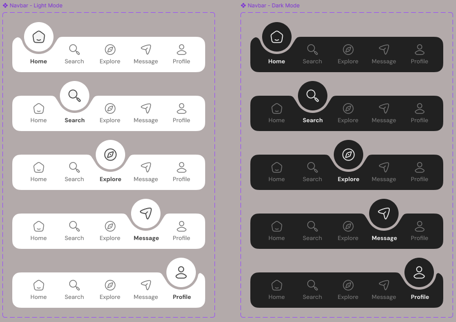
Best Practices for Navbar Design
- Clarity Over Creativity
Icons and labels should be easily recognizable. Overly abstract icons may look stylish, but if users have to guess their meaning, the design has failed. - Consistency is Key
Navigation patterns (tab bar, drawer, bottom navigation) should remain consistent across the app. Switching styles mid-flow creates confusion. - Balance Functionality and Minimalism
While it’s tempting to fit everything into the navbar, less is more. Prioritize the most used actions, and consider secondary menus for less frequent ones. - Use Micro-Interactions
Adding subtle animations, like a smooth highlight when switching tabs, makes the experience feel polished and intentional. - Plan for Accessibility
Larger tap targets, adequate spacing, and contrast-friendly designs ensure inclusivity.
Pixel-Perfect Development: From Design to Reality
Designing in Figma is only half the journey. The real challenge comes in development: ensuring the implemented navbar matches the design down to the pixel.
Pixel-perfect development doesn’t mean obsessing over every single pixel—but it does mean that the final app reflects the designer’s intent accurately. When developers cut corners, spacing shifts, colors feel off, and fonts lose hierarchy.
Here’s how we achieve pixel perfection:
- Design Handoff Best Practices
Designers should provide developers with clear spacing, grid, and component specifications in Figma. Redlines and auto-layout constraints reduce ambiguity. - Responsive Scaling
Mobile devices come in countless screen sizes. Developers should use scalable units (e.g.,dp,pt, or%) rather than fixed pixel values. - Testing Across Devices
Always preview the navbar on multiple devices and simulators. A design that looks great on iPhone 14 might feel cramped on a smaller Android device. - Using Design Tokens
Centralize values for colors, typography, and spacing. This ensures consistency across the navbar and reduces errors during updates.
Common Mistakes to Avoid
- Overcrowding the Navbar: Too many icons or text labels reduce clarity.
- Ignoring Platform Guidelines: Android and iOS have different navigation patterns; ignoring these can feel unnatural to users.
- Neglecting Dark Mode: If the navbar isn’t optimized for dark themes, it can ruin the visual balance.
- Skipping User Testing: Even pixel-perfect navbars should go through usability testing. What looks perfect on screen might confuse real users.
The UI Studio Approach
At The UI Studio, we don’t just design navbars—we design user journeys. Our process combines:
- Wireframing the navigation flow
- Prototyping interactive navbars in Figma
- Testing with real users for intuitiveness
- Pixel-perfect handoff for seamless development
The result? Navbars that feel natural, scalable, and brand-aligned, while staying development-friendly.
Final Thoughts
Your mobile app navbar is more than just a strip of buttons—it’s the anchor of your user experience. By focusing on clarity, consistency, and pixel-perfect execution, you ensure your app feels professional, intuitive, and ready to compete in the crowded app marketplace.
If you’re planning your next app, don’t underestimate the navbar. At The UI Studio, we help founders, startups, and enterprises design navigation systems that blend usability with aesthetics—because every pixel matters.