Crypto apps have seen a surge in popularity, with each offering unique features, such as royalty-based systems or P2P trading. At The UI Studio, we’ve received numerous requests from our community and engaged in discussions about potential crypto app UI design projects with clients. Inspired by these interactions, we decided to share some of the top crypto app UI design concepts created in Figma.
Crypto App UI Design Concepts in Figma
We aim to keep it concise, offering ideas to help you kickstart your crypto app design whether for a client or your next startup project.
Getting Started: Seamless Onboarding for Crypto Users
A smooth and intuitive onboarding experience is key to retaining users. Our design ensures effortless navigation and clear steps to get users started on your app.
We used an image that appears to convey a modern and tech-savvy feel, which is suitable for the cryptocurrency market. Here are a few points to consider about its effectiveness in that context:
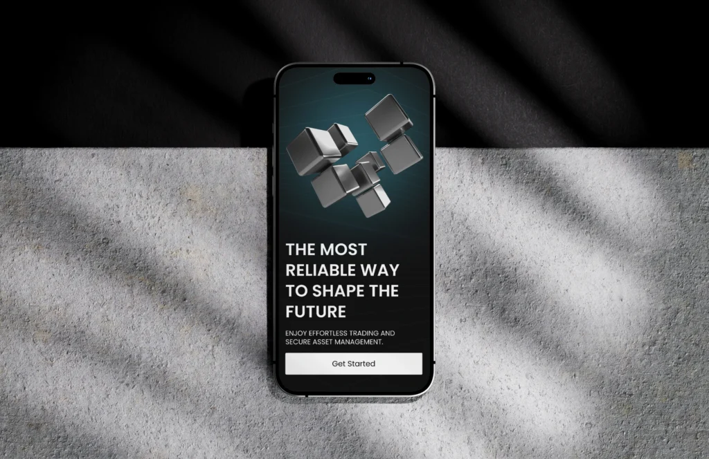
Overall Composition
Ensured that the blocks and text are well-balanced and that the image is not too cluttered, allowing for easy readability.
Visual Appeal
The use of blocks symbolizes stability and structure, which is essential in a volatile market like crypto. This can help convey trustworthiness.
Color Scheme
If the colors are dark with contrasting elements, it can evoke a sense of professionalism and seriousness, appealing to potential investors.
Text Clarity
The message “THE MOST RELIABLE WAY TO SHAPE THE FUTURE” is strong and aspirational, fitting well with crypto’s innovative nature.
Call to Action
The “Get Started” button is clear and encourages user engagement, which is vital for conversion.
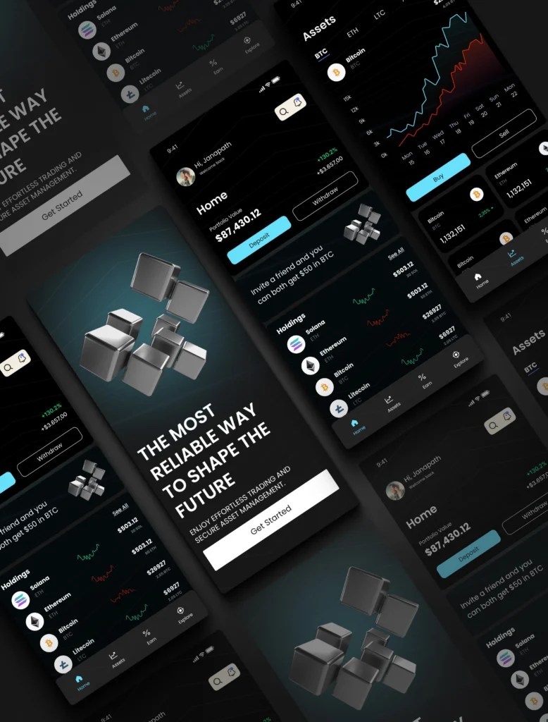
Home Screen: The Gateway to Crypto Insights
The home screen serves as the hub for all activities. Designed for clarity and engagement, it highlights market trends, user portfolios, and essential tools. Here’s a detailed description:
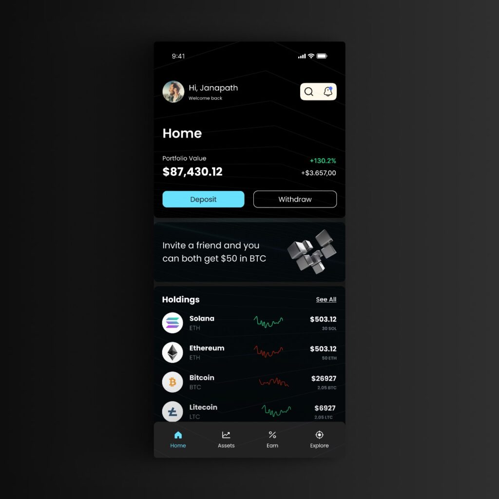
Layout and Design
- Dark Theme: The overall dark background enhances the visibility of the text and graphical elements, providing a sleek and contemporary look.
- Header: Displays a greeting (“Hi, Janapath”) and a welcome message, creating a personalized user experience.
- Portfolio Value: Prominently featured at the top, showing the total portfolio value ($87,430.12) and a percentage change (+130.21%), along with a dollar amount increase (+$3,676.00). This provides users with quick insights into their investments.
Main Action Buttons
- Deposit and Withdraw: Clearly labeled buttons facilitate quick transactions, emphasizing the app’s functionality. These are likely designed for high visibility to encourage user engagement.
Holdings Section
- Block Display: Each cryptocurrency holding (e.g., Solana, Ethereum, Bitcoin, Litecoin) is organized in blocks, making it easy to scan and compare values.
- Holdings Information: Each block shows the name, ticker symbol, and current value, providing essential information at a glance.
- Graphs/Trends: Small line graphs next to each holding visually represent the performance trends, enabling users to quickly assess the market movements of their assets.
Additional Features
- Referral Invite: A prominent section encourages users to invite friends, offering a reward ($50 in BTC) for successful referrals. This feature not only promotes user engagement but also fosters community growth.
Overall User Experience
- Intuitive Navigation: The layout is clean and organized, allowing users to easily navigate their portfolio and make transactions.
- Modern Aesthetic: The color palette and design elements reflect current trends in fintech apps, appealing to a tech-savvy audience.
Assets Screen: Managing Investments with Ease
Our assets screen is crafted to display cryptocurrency holdings, balances, and performance stats in a visually appealing and user-friendly layout.
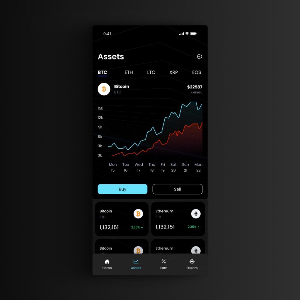
Visual Hierarchy
- Prominent Graph: The line graph represents asset performance clearly, using contrasting colors (green for upward trends and red for downward trends) to indicate changes effectively. This immediately draws the user’s attention to performance metrics.
- Asset Information: Key information about each asset (like name, symbol, and value) is displayed prominently, ensuring users can quickly identify their holdings.
Color Scheme
- Dark Mode Aesthetic: The black background enhances readability and provides a modern, sleek look. It also helps the colorful graph and other elements stand out, making the information more digestible.
- Contrast: The use of contrasting colors for the graph lines ensures that users can differentiate between various trends at a glance.
User Interaction
- Action Buttons: The “Buy” and “Sell” buttons are clearly visible at the bottom, making it easy for users to take action. Their design suggests functionality and encourages interaction without being overwhelming.
- Intuitive Layout: The layout flows logically, allowing users to scan through information from the graph at the top to detailed asset information below.
Typography
- Readability: The font choices are likely clean and legible, which is crucial for users who may need to read information quickly, especially in a financial context where clarity is paramount.
Information Density
- Concise Display: The design presents a good balance of information without clutter. Users can see essential details at a glance without feeling overwhelmed.
Responsive Design
- Mobile-Friendly: The design appears well-optimized for mobile use, making it accessible for users on the go. The layout is likely adaptable to various screen sizes, enhancing usability.
Data Visualization
- Effective Graph Representation: The line graph provides a clear visual representation of trends over time, which is crucial for asset management. This allows users to make informed decisions based on visual data.
Crypto Trading App UI Design: Selecting the Perfect Color Palette and Font in Figma
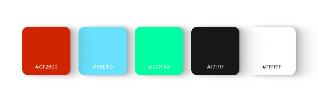
We used Poppins font. Poppins is a modern, geometric sans-serif font that enhances readability and professionalism in a crypto app, increasing trust and appealing to tech-savvy users.
The color palette we’ve chosen has a mix of vibrant and neutral colors, which can work well in a cryptocurrency app. Here’s a breakdown of how these colors might fit the context:
- #CF2600 (Red): This can evoke urgency or alertness. It’s great for notifications or important alerts but should be used sparingly to avoid overwhelming users.
- #68E1FD (Light Blue): This color is calming and can represent trust and reliability, which is essential in finance and crypto.
- #00FFA3 (Mint Green): This is fresh and modern, suggesting growth and innovation. It’s suitable for positive indicators or actions.
- #171717 (Dark Gray): This provides a solid background that adds depth and a professional look. It contrasts well with lighter colors.
- #FFFFFF (White): This is essential for readability and balance, ensuring that text and other elements stand out.
Overall Match with the App Context
- Modern and Professional: The combination of these colors gives a contemporary feel, which is important in the tech-savvy crypto market.
- Readability: Ensure that text stands out against backgrounds for easy reading, especially with the dark gray and light colors.
- Emotional Response: The vibrant colors can engage users, making them feel excited about the app and its offerings.
FAQs
Why is a Personalized Onboarding Experience Crucial for a Crypto App UI?
A tailored onboarding ensures new users can easily navigate the app, understand its features, and feel confident managing their investments, enhancing retention.
How Does the Color Palette Influence the User Experience in a Crypto App?
The chosen colors balance vibrancy and professionalism, helping convey trust, clarity, and innovation while ensuring readability and user engagement.
What Are Key Design Considerations for Managing Assets in a Crypto App?
Focus on clear data visualization, intuitive navigation, and actionable elements like “Buy” or “Sell” buttons to empower users to make informed decisions efficiently.
Explore Our UI/UX Work and Connect with Us
We believe in sharing our design journey and showcasing our projects across various platforms. You can explore our latest work, get inspired, or connect with us through the following links:
- Behance: Browse our portfolio for in-depth project showcases.
- Instagram: Stay updated with our latest designs and creative processes.
- LinkedIn: Connect with us professionally and discover our industry expertise.
- Website: Visit our website for more about our services and offerings.
Feel free to reach out and engage with us on any platform, or comment below here on the blog! We’d love to hear from you!