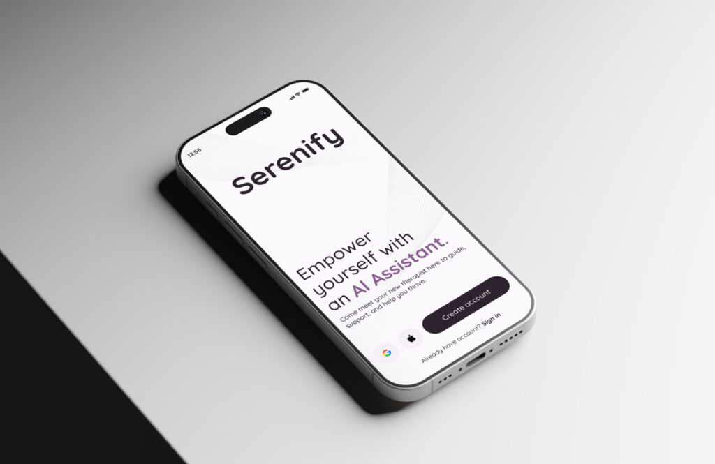
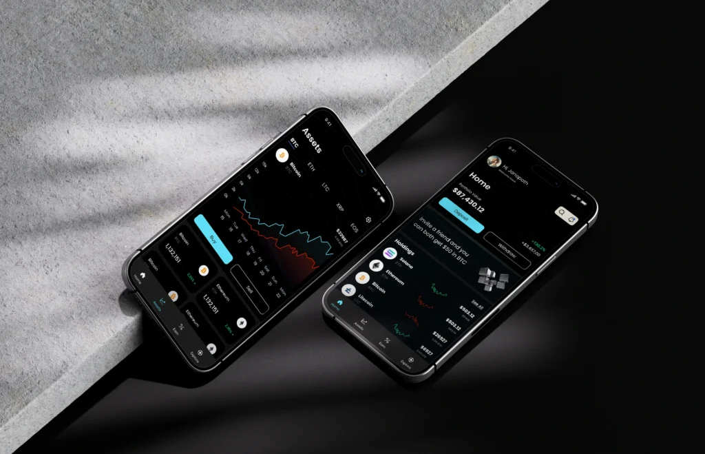
In today’s fast-paced digital world, a thoughtfully designed mobile app can really elevate user experience, particularly in finance and AI. The way these apps are designed is key to how users engage with their financial data and services. Here, we’ll take a closer look at the UI design of our finance mobile app concept, highlighting its user-friendly layout and visual appeal. Furthermore, take a look at our crypto mobile app concept, offering a broader perspective on contemporary financial solutions.
Finance Mobile App UI in Figma – Screens Overview
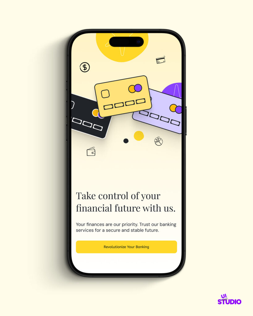
Splash Screen
The journey begins with a welcoming splash screen that sets the tone for the app. Featuring a clean design, it emphasizes the core message: “Take control of your financial future with us.” The playful use of colors and illustrations of bank cards creates an inviting atmosphere, ensuring users feel confident about their financial journey from the very start.
Our designers also create custom assets tailored to various design objectives. These assets can be seamlessly integrated into websites, mobile UI designs, and more.
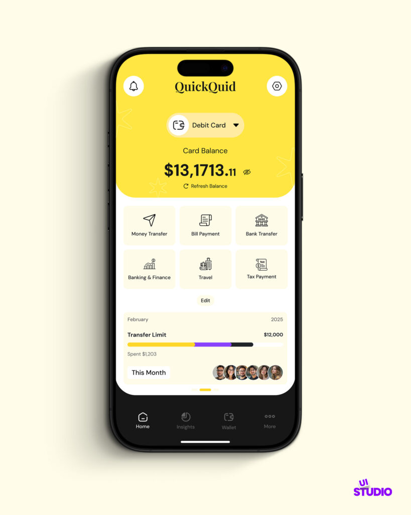
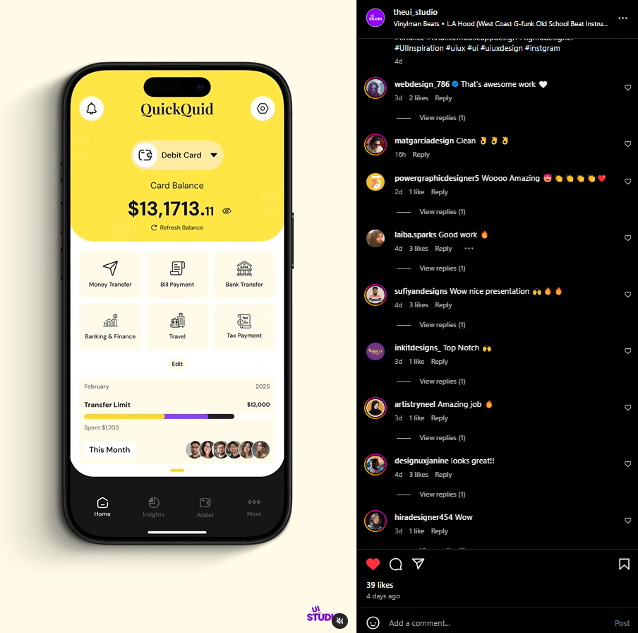
Account Overview
Once users log in, they are greeted with the account overview screen. This section is designed for clarity and ease of use. The prominent display of the card balance ($13,171.11) grabs attention, while essential features like “Money Transfer,” “Bill Payment,” and “Bank Transfer” are easily accessible. The layout allows users to monitor their finances at a glance, with key metrics and spending summaries clearly presented.
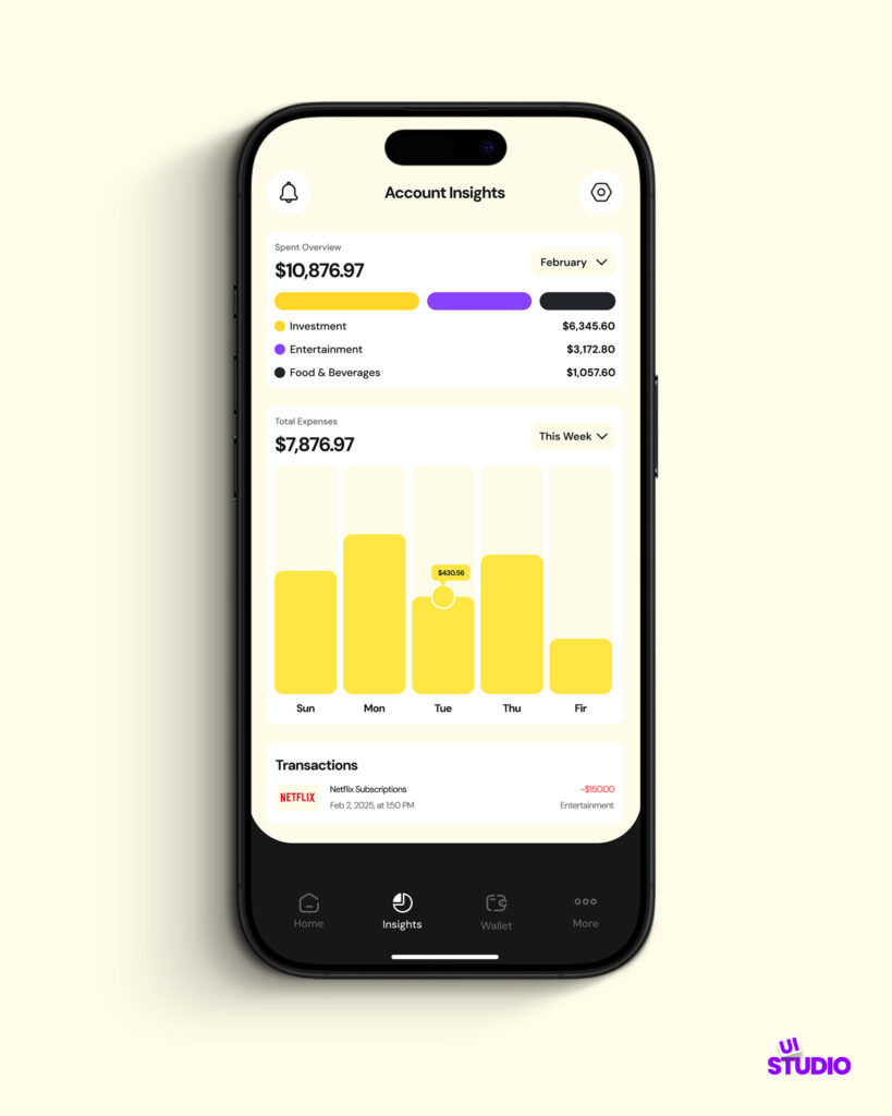
Account Insights
Diving deeper, the account insights screen offers users a comprehensive view of their financial activity. The use of charts and graphs provides an interactive experience, allowing users to analyze their spending habits and track their investments. The color-coded sections enhance readability, guiding users through their transactions and expenses effectively.
Finance Mobile App UI – Design System
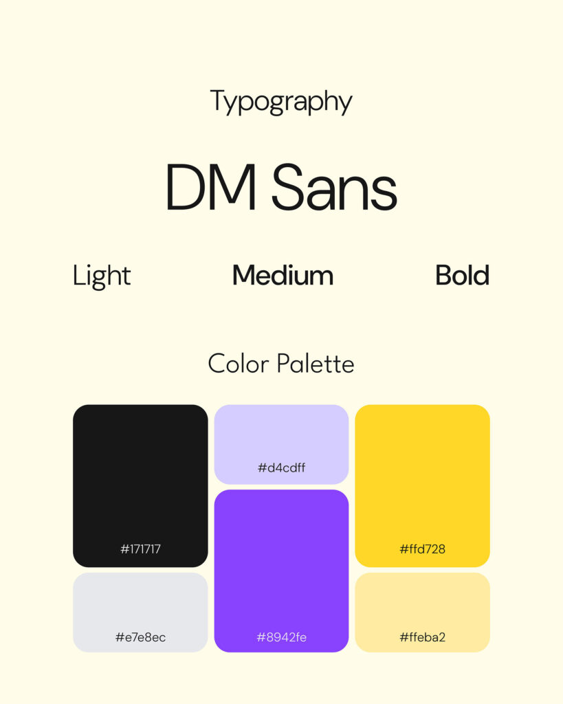
Typography, Color Palette & Grid
A critical element of the app’s design is its typography and color palette. Utilizing DM Sans in varying weights (Light, Medium, Bold) ensures text clarity and readability across all screens. The color palette features a blend of vibrant shades, including a striking yellow (#fffd28) and a calming purple (#8942fe), creating a visually appealing interface that resonates with users.
Grid System
In our finance mobile app design, we utilize a grid system to ensure a consistent and organized layout. A well-structured grid helps maintain alignment and spacing, which is crucial for enhancing readability and user experience.
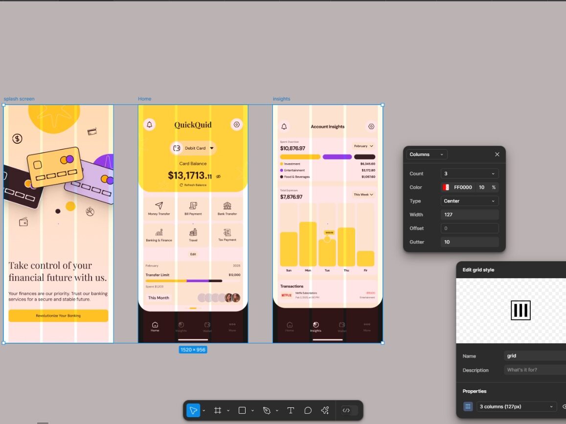
Key Features of Our Grid System:
- Column Structure: We typically use a 12-column grid, which allows for flexible layouts. This structure enables us to create various design configurations, accommodating different content types.
- Responsive Design: The grid system adapts to different screen sizes, ensuring that the app looks great on all devices. This responsiveness is vital for maintaining usability across smartphones and tablets.
- Margins and Padding: Consistent margins and padding within the grid create a clean and uncluttered interface, allowing users to focus on their financial data without distractions.
- Alignment: Using the grid system ensures that all elements are properly aligned, which enhances the overall aesthetic appeal of the app and improves navigation.
By implementing this grid system in Figma, we can create a visually appealing and highly functional finance mobile app that empowers users to manage their finances with ease.
User-Centric Design for Our Finance Mobile App
The design of our finance mobile app prioritizes user experience, combining functionality with aesthetic appeal. By focusing on simplicity, clarity, and engagement, we aim to empower users in managing their finances confidently. We believe that a well-crafted UI can revolutionize banking, making it more accessible and enjoyable for everyone.
Enhance Your Financial App Design with The UI Studio
Are you ready to transform your financial app vision into reality? Let The UI Studio elevate your user experience with our expert design services. Reach out to us today at info@theuistudio.com to kick off your next financial app project!
Community Feedback
Take a look at the community praising our design for QuickQuid! The feedback has been overwhelmingly positive, with comments highlighting the project’s aesthetic and functionality. Users have expressed their admiration with remarks like “That’s awesome work” and “Wow, nice presentation,” showcasing their appreciation for the clean and user-friendly interface. Enthusiastic responses such as “Woooo Amazing!” and “Top Notch!” further emphasize the design’s impact. This enthusiastic reception demonstrates that our efforts have truly resonated with the audience, reinforcing the success of our design approach.
Be sure to check out our Game Store app UI design, which has been highly praised by the community!
Explore Our UI/UX Work
We believe in sharing our design journey and showcasing our projects across various platforms. You can explore our latest work, get inspired, or connect with us through the following links:
- Behance: Browse our portfolio for in-depth project showcases.
- Instagram: Stay updated with our latest designs and creative processes.
- LinkedIn: Connect with us professionally and discover our industry expertise.
- Website: Visit our website for more about our services and offerings.
Feel free to reach out and engage with us on any platform, or comment below here on the blog! We’d love to hear from you!