You’ve spent hours perfecting your Figma designs. Every pixel is in place, every interaction is smooth, and your design system is chef’s kiss. Then comes the development phase, and suddenly your beautiful responsive design looks broken on an iPad Pro, janky on a Samsung Galaxy, and completely unusable on your client’s ancient desktop monitor.
Sound familiar? You’re not alone. The gap between design tools and real-world implementation is where most responsive design projects falter. But here’s the thing: responsive design isn’t just about making things smaller or bigger—it’s about creating experiences that adapt intelligently to how people actually use their devices.
The Reality Check: Why Most Responsive Designs Fail
Before we dive into solutions, let’s address the elephant in the room. Most responsive websites fail not because of bad design, but because of these three critical mistakes:
Mistake #1: Designing for three breakpoints (mobile, tablet, desktop) when users interact with dozens of viewport sizes
Mistake #2: Treating responsive design as a CSS afterthought instead of a core design principle
Mistake #3: Ignoring the context of use—a mobile user has different needs than a desktop user, even when viewing the same content
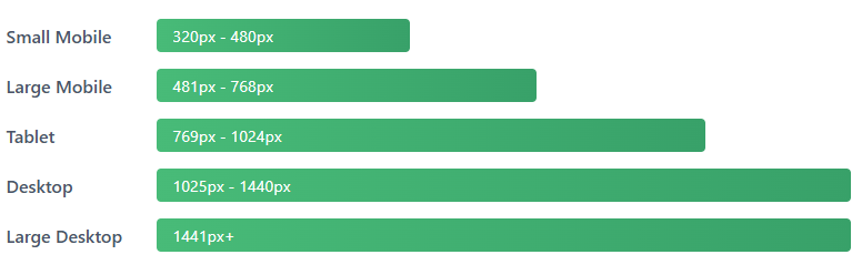
Understanding Modern Breakpoints (Spoiler: They’re Not What You Think)
Let’s start by challenging conventional wisdom. The traditional breakpoints (320px, 768px, 1024px, 1440px) were established when the device landscape was simpler. Today, we have everything from foldable phones to ultrawide monitors, and your design needs to work on all of them.
The Container Query Revolution
Here’s where things get exciting. CSS Container Queries (now widely supported) allow components to respond to their container’s size rather than the viewport. This means your card component can adapt whether it’s in a sidebar, a main content area, or a modal—without media queries.
.card-container {
  container-type: inline-size;
}

@container (min-width: 400px) {
  .card {
    display: grid;
    grid-template-columns: 1fr 2fr;
  }
}
This isn’t just a technical improvement—it fundamentally changes how we think about component design. Your components become truly modular and context-aware.
The Figma-to-Code Workflow That Actually Works
Let’s get practical. Here’s a workflow that bridges the gap between your Figma designs and production-ready responsive code:
Step 1: Design with Constraints, Not Just Artboards
In Figma, use Auto Layout with min/max width constraints. This forces you to think about how components behave at different sizes during the design phase, not after. Set up your frames with these properties:
- Minimum width constraints on text containers to prevent awkward single-word lines
- Maximum width constraints on content areas for readability (typically 65-75 characters per line)
- Flexible spacing using Auto Layout’s “Space Between” instead of fixed margins
- Component variants for different states AND sizes
Just like we do in our pixel-perfect Figma to HTML/CSS/JS conversions, planning constraints early saves development time.
Step 2: Build with Fluid Typography and Spacing
Static font sizes are dead. Modern responsive design uses clamp() to create fluid typography that scales smoothly between breakpoints:
h1 {
  font-size: clamp(2rem, 5vw + 1rem, 4rem);
}

.container {
  padding: clamp(1rem, 3vw, 3rem);
}
This approach eliminates jarring jumps in text size and creates a more cohesive experience across devices. No more “too small on tablet, too large on desktop” complaints.

Step 3: Think in Components, Not Pages
Your hero section, navigation, card layouts, and forms should all be designed as independent, responsive components. Each should work beautifully at any size without relying on page-level context.
Example of Responsive Grid:
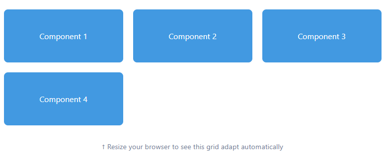
.grid {
  display: grid;
  grid-template-columns: repeat(auto-fit, minmax(250px, 1fr));
  gap: 20px;
}
This creates a grid that automatically adjusts the number of columns based on available space—no media queries needed!
Advanced Techniques for Real-World Projects
1. Viewport-Aware Content Strategy
Not all content needs to be visible everywhere. Use CSS to progressively enhance content based on available space, but do it semantically so screen readers and SEO aren’t affected:
.extended-description {
  display: none;
}

@media (min-width: 768px) {
  .extended-description {
    display: block;
  }
}
Pro Tip: Use the content-visibility CSS property for content that’s hidden on mobile but present in the DOM. This improves rendering performance while keeping content accessible.
2. Touch-Friendly Without Sacrificing Desktop UX
Mobile-first doesn’t mean mobile-only. Your touch targets should be at least 44x44px on mobile (Apple’s guideline) and 48x48px (Google’s), but you can make them more compact on desktop where precision is easier:
button {
  min-height: 44px;
  padding: 12px 24px;
}

@media (hover: hover) and (pointer: fine) {
  button {
    min-height: 36px;
    padding: 8px 20px;
  }
}
Notice we’re using interaction media queries (hover: hover) rather than viewport size. This targets the actual input method, making your interface adaptive to how users interact, not just screen size.
3. Performance-Aware Image Delivery
Responsive design isn’t just about layout—it’s about delivering appropriate resources. Use the picture element with art direction for images that need different crops at different sizes:
<picture>
  <source media="(max-width: 768px)"
          srcset="hero-mobile.jpg">
  <source media="(max-width: 1200px)"
          srcset="hero-tablet.jpg">
  <img src="hero-desktop.jpg" alt="Hero">
</picture>
Testing Your Responsive Design (Beyond Chrome DevTools)
DevTools are great for initial testing, but they can’t replace real devices. Here’s your testing checklist:
- Real Device Testing: Test on at least one iOS device, one Android device, and one tablet. Pay attention to how the software keyboard affects your layout.
- Browser Variations: Safari handles CSS differently than Chrome. Firefox has its quirks. Test all major browsers.
- Landscape Mode: Everyone forgets landscape mode until a client complains. Test it.
- Slow Connections: Use Chrome’s network throttling to test on 3G. Your fluid animations might be choppy on slower connections.
- Text Scaling: Users can increase system font sizes. Your layout should handle 200% text zoom without breaking.
Common Pitfalls and How to Avoid Them
Pitfall 1: Horizontal Scrolling on Mobile
This usually happens with fixed widths or negative margins. Always set max-width: 100% on images and use overflow-x: hidden judiciously (but not as a crutch for poor responsive design).
Pitfall 2: Unreadable Text on Small Screens
Never let your body text go below 16px on mobile. Better yet, use clamp(16px, 4vw, 18px) so it scales naturally.
Pitfall 3: Navigation That Doesn’t Work on Touch
Hover-dependent navigation is a no-go. Always provide touch-friendly alternatives like a hamburger menu or visible nav items.
The Future: What’s Next for Responsive Design
As we look ahead, several emerging technologies will shape responsive design:
- Foldable Devices: Phones that unfold into tablets require designs that adapt to not just different sizes, but different form factors mid-session.
- CSS Anchor Positioning: Coming soon to all browsers, this will revolutionize how we create tooltips, popovers, and contextual menus that work responsively.
- Variable Fonts: Fonts that can adapt their weight, width, and style dynamically, giving us even more control over typography at different viewports.
Your Action Plan
Here’s what you should do right after reading this:
- Open your current Figma project and add min/max width constraints to your auto-layout frames
- Replace your fixed font sizes with clamp() functions in your CSS
- Test your latest project on a real mobile device (not just DevTools)
- Implement one container query in your next component
- Add proper touch targets to your buttons and interactive elements
Remember: Responsive design is not a feature you add at the end—it’s a mindset you adopt from the very first Figma frame. Design with constraints, build with flexibility, and test ruthlessly.
The gap between Figma and flawless implementation isn’t unbridgeable. With the right workflow, modern CSS techniques, and a component-first approach, you can create responsive designs that not only look good on paper but work beautifully in the real world—across every device, browser, and use case your users throw at them.
Now go forth and build something that actually responds to your users’ needs. Your future self (and your QA team) will thank you.
Image Suggestions for WordPress
Add these images at the following sections (you can create them in Canva or use stock photos):
- After the introduction: A split-screen image showing a beautiful Figma design on one side and a broken mobile website on the other
- After “Understanding Modern Breakpoints”: An infographic showing different device sizes with their breakpoint ranges
- After “Container Query Revolution”: A diagram showing how a card component adapts in different container sizes
- After “Fluid Typography”: A visual comparison of static vs fluid typography at different screen sizes
- After “Touch-Friendly Design”: An illustration showing touch target sizes (44x44px) vs desktop button sizes
- After “Performance-Aware Images”: A comparison showing appropriate image sizes for mobile vs desktop
- End of article: A call-to-action banner or infographic summarizing the 5-step action plan
SEO Meta Data
Title Tag: From Figma to Flawless: Building Responsive Websites That Work | [Your Site Name]
Meta Description: Learn how to bridge the gap between Figma designs and production-ready responsive websites. Master modern CSS techniques, fluid typography, container queries, and testing strategies.
Focus Keyword: responsive web design
Secondary Keywords: Figma to code, CSS container queries, fluid typography, mobile-first design, responsive design workflow
Tags: Responsive Design, Figma, Web Development, CSS, UX Design, Front-End Development, Mobile Design